
Leaguers
Role
Product designer
Team
1 Tech Lead, 1 Designer
Timeline
Oct 2022 - May 2023
Skills
Product design, interface design, interaction design, prototyping, usability testing
Context
Leaguers connects college mentors with high schoolers for college essay support.
The platform moved away from using Google Docs to a built-in essay review system for secure, all-in-one collaboration.
Problem
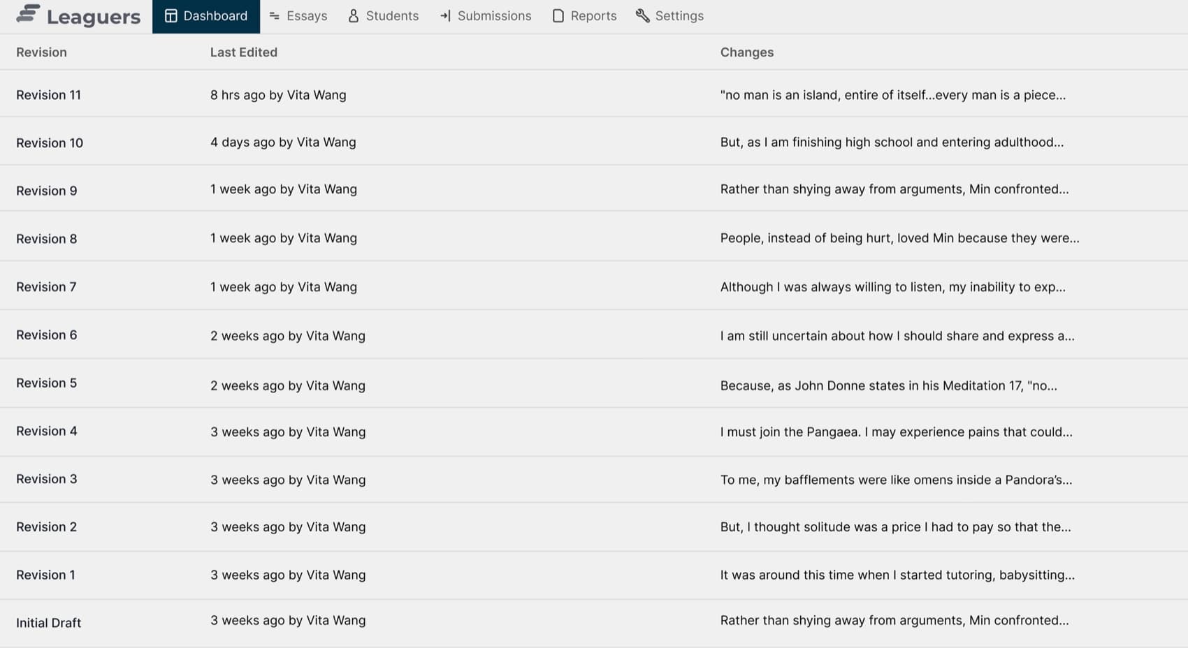
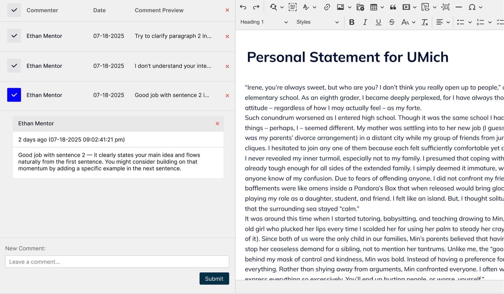
The current interface feels outdated and unintuitive with cluttered layouts and inconsistent visuals.
Leaguers needs a new platform that has a modern interface that feels current, trustworthy and causes no friction.
Solution
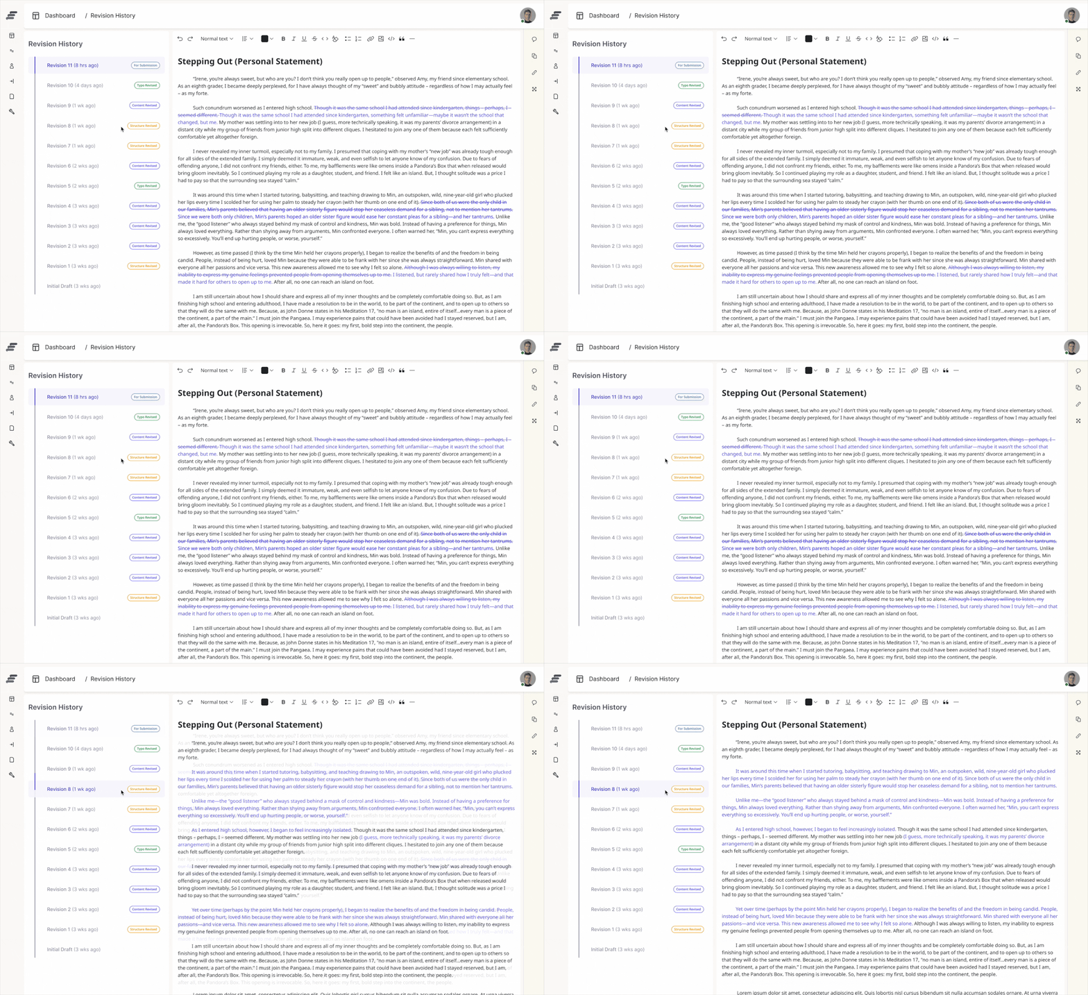
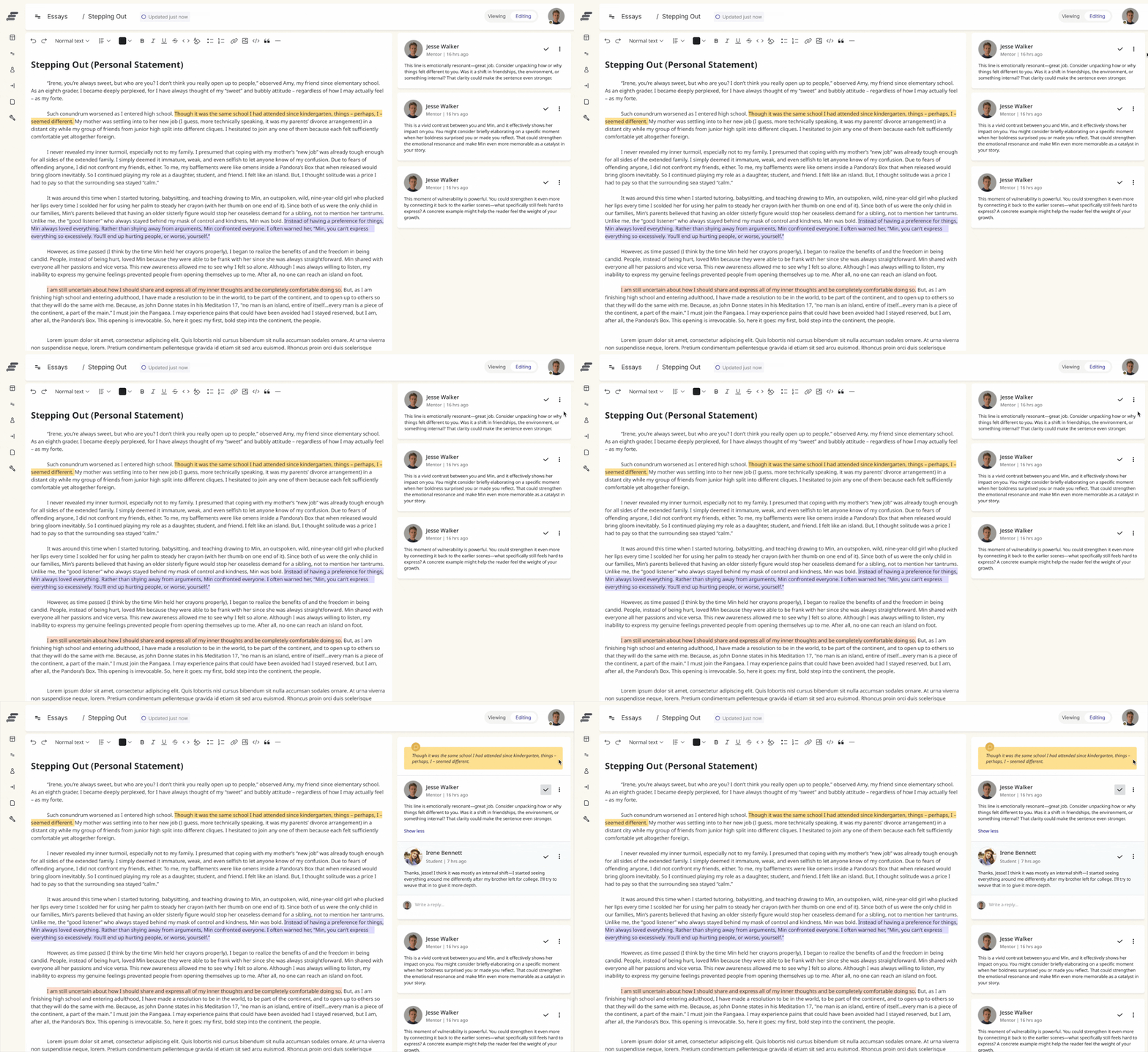
Redesigned experience with inline comments, revision tracking, and collaborative mentor-student interactions.
Introduced clearer contextual feedback and streamlined revision comparison to make the feedback process easier and less overwhelming.
User Interviews
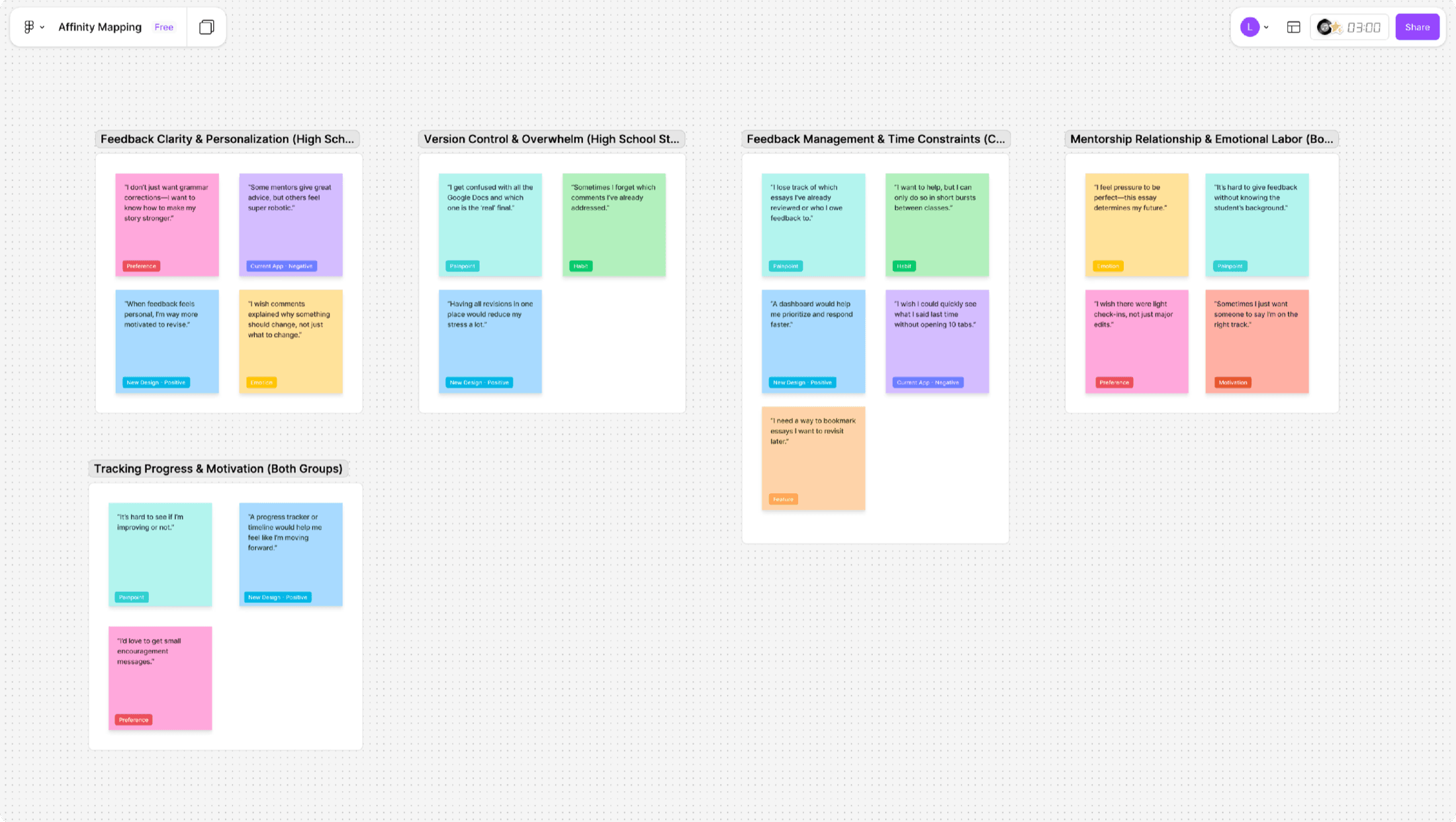
Conducted interviews with 10 participants
Including existing users and individuals familiar with similar platforms to understand essay writing, feedback, and mentoring workflow challenges.
Findings From Interview
High school students
Need clearer guidance amid multiple essay versions and scattered feedback.
College mentors
Struggle to manage multiple students, essays, and unstructured feedback.
Both groups
Need structure for a personal and emotionally demanding writing process.
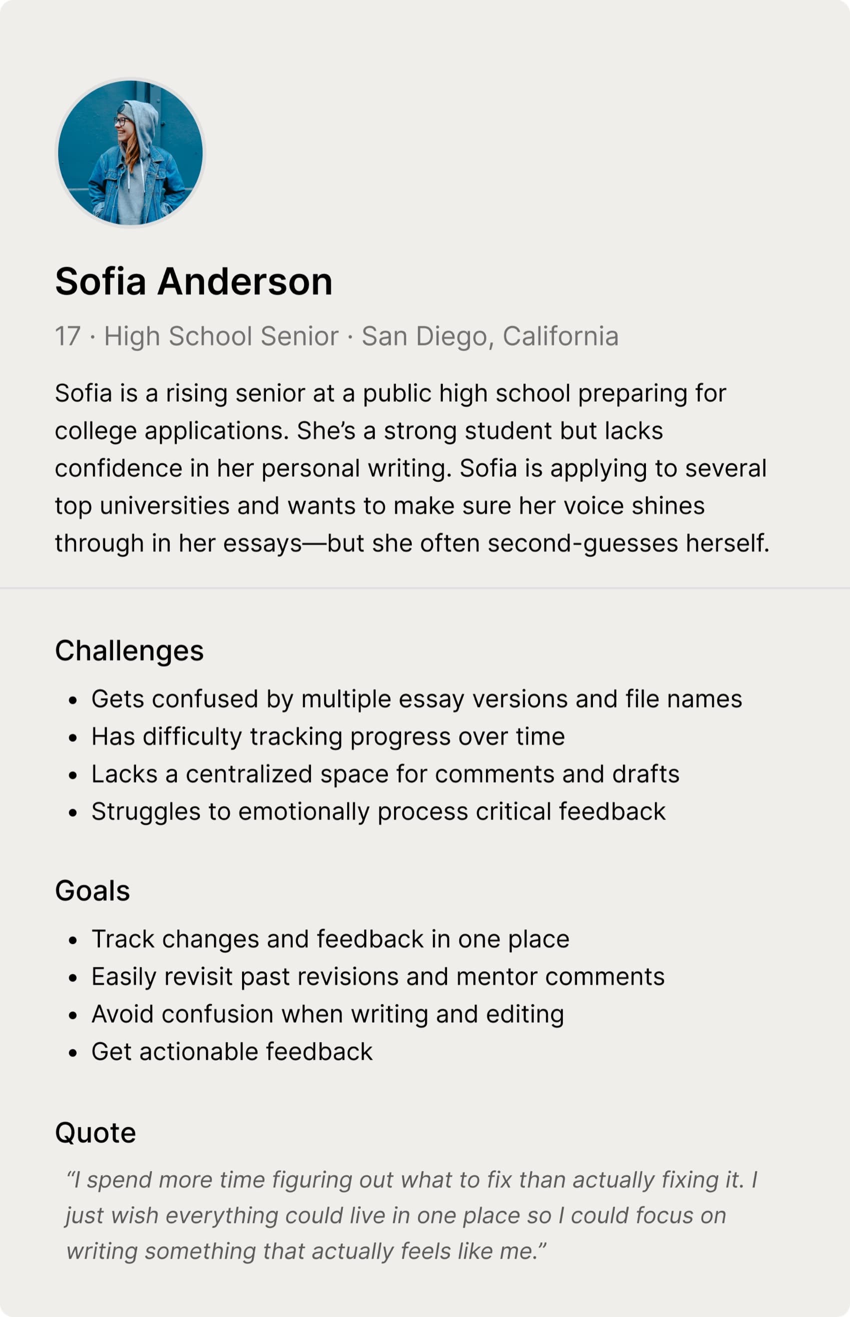
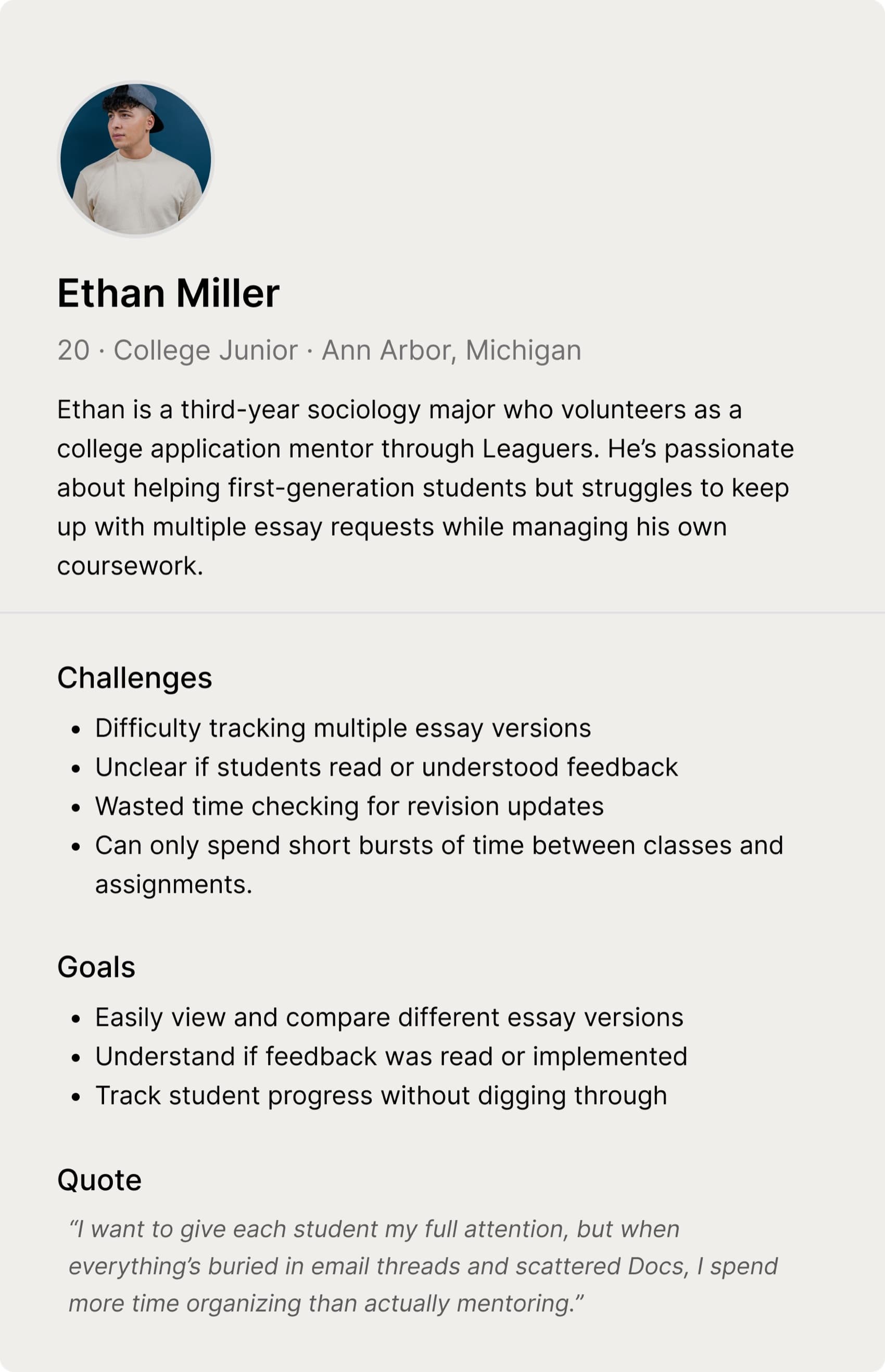
User Persona
Based on interview findings, I developed personas for students and mentors to capture their different needs, behaviors, and expectations.
Design Statement
How might we make essay feedback easier to give, clearer to receive, and smoother to manage for both students and mentors?
Solution 1
In-Line Feedback Interface
Mentors can leave inline feedback with comments organized by type, reducing context-switching while making suggestions clearer and easier for students to understand.
Process Overview
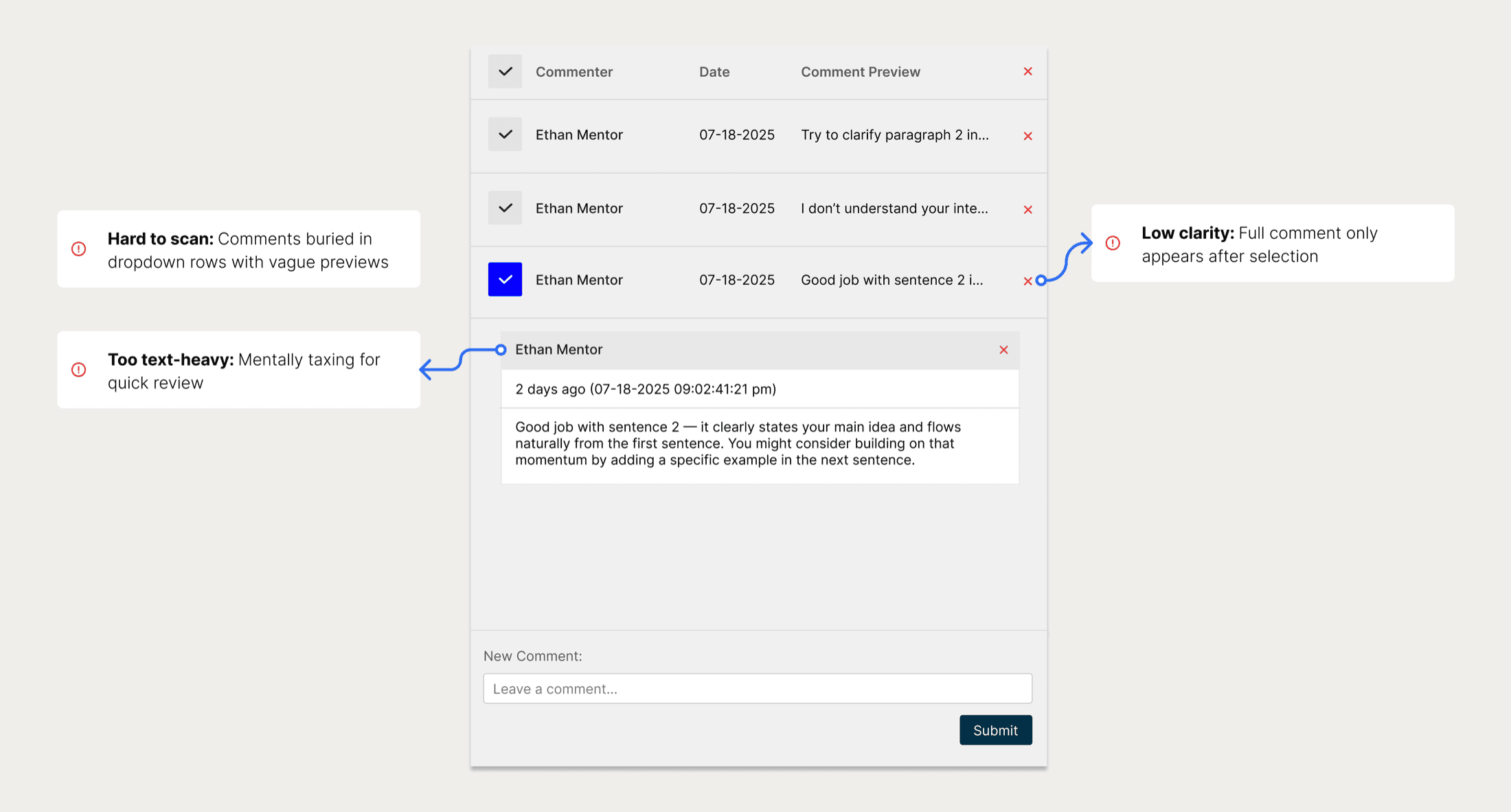
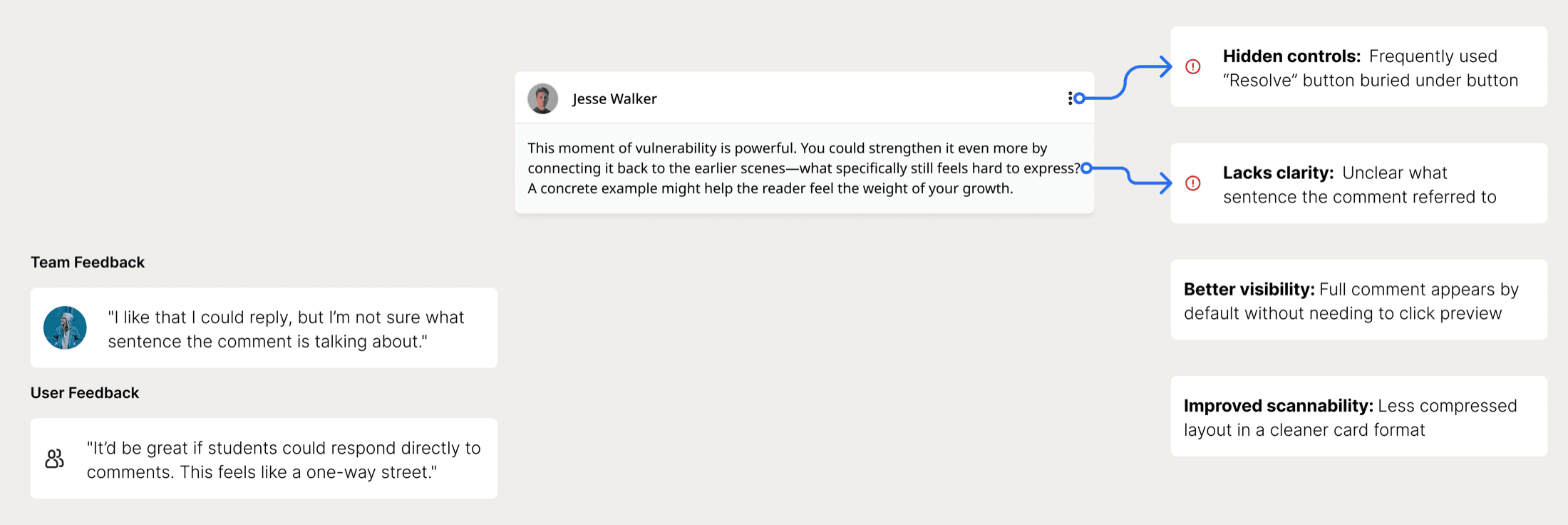
Before
Hidden interactions, vague previews, and disconnected feedback made it hard for students to quickly understand comments.
Iteration
Visibility and scanability was improved with card layout and showing full content. But users still struggled to identify which sentence feedback referred to and interaction felt one-sided.
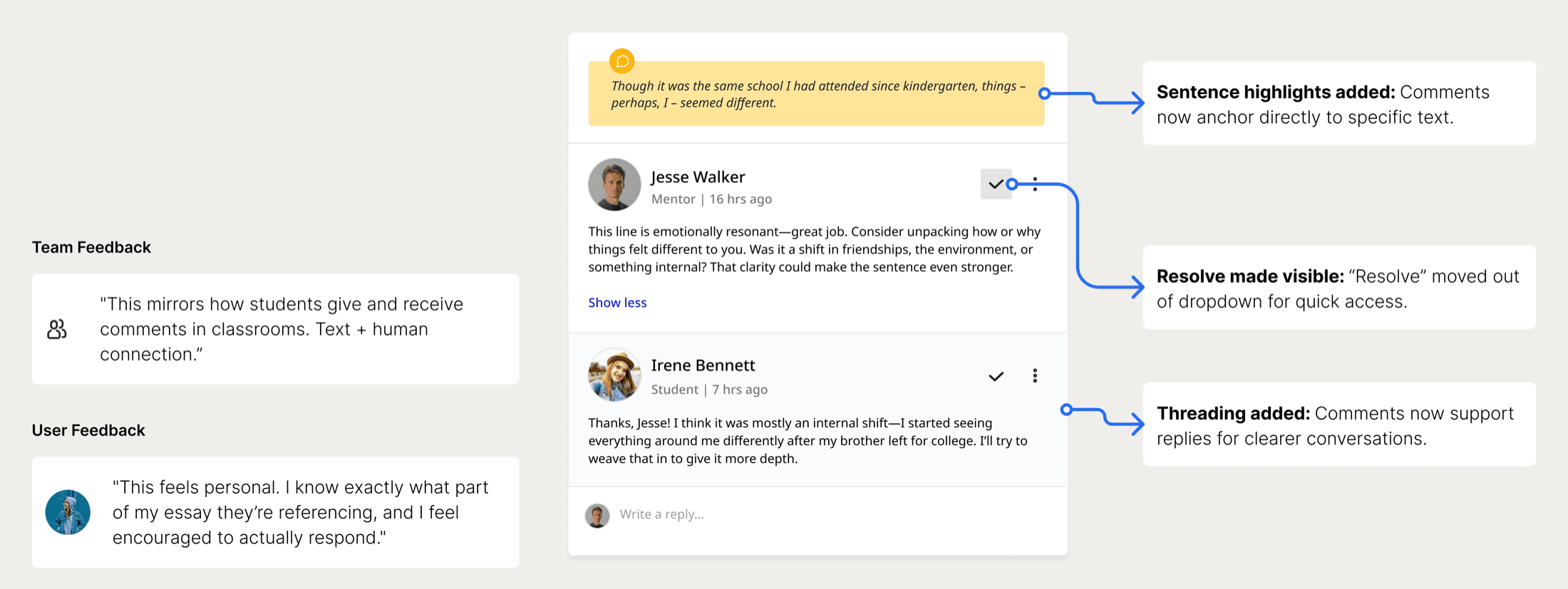
Clarify Intent
Final design added sentence highlights and threaded replies. This made feedback easier to understand, navigate, and respond to.
Solution 2
Essay History & Feedback Timeline
Allows to track revisions and feedback over time, making progress easier to understand, improving mentorship, and keeping essay versions organized.
Process Overview
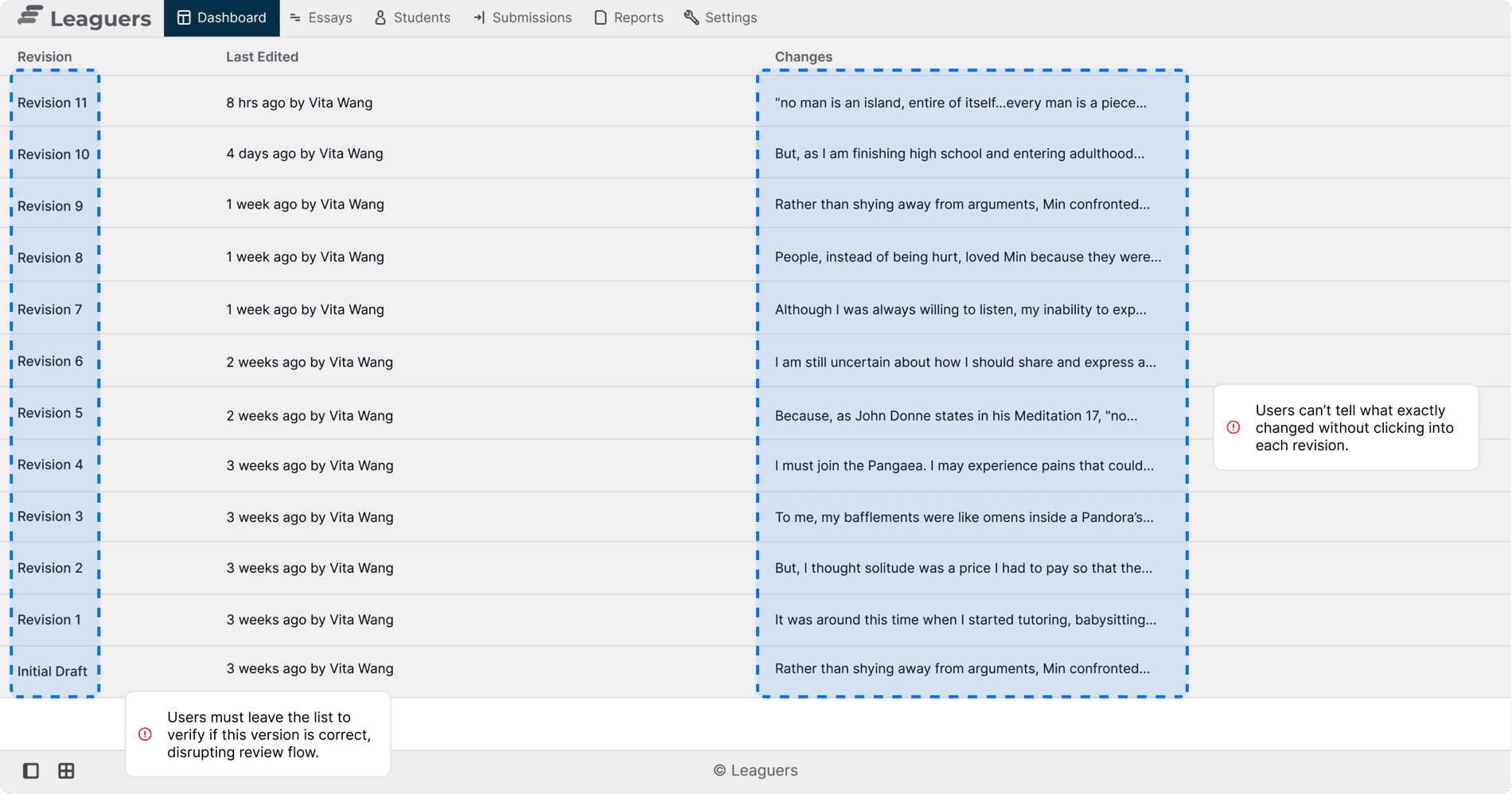
Before (Interface)
The revision history interface relied heavily on text labels, forcing users to click into each version without enough context. This made navigation inefficient and increased cognitive load during essay revisions.
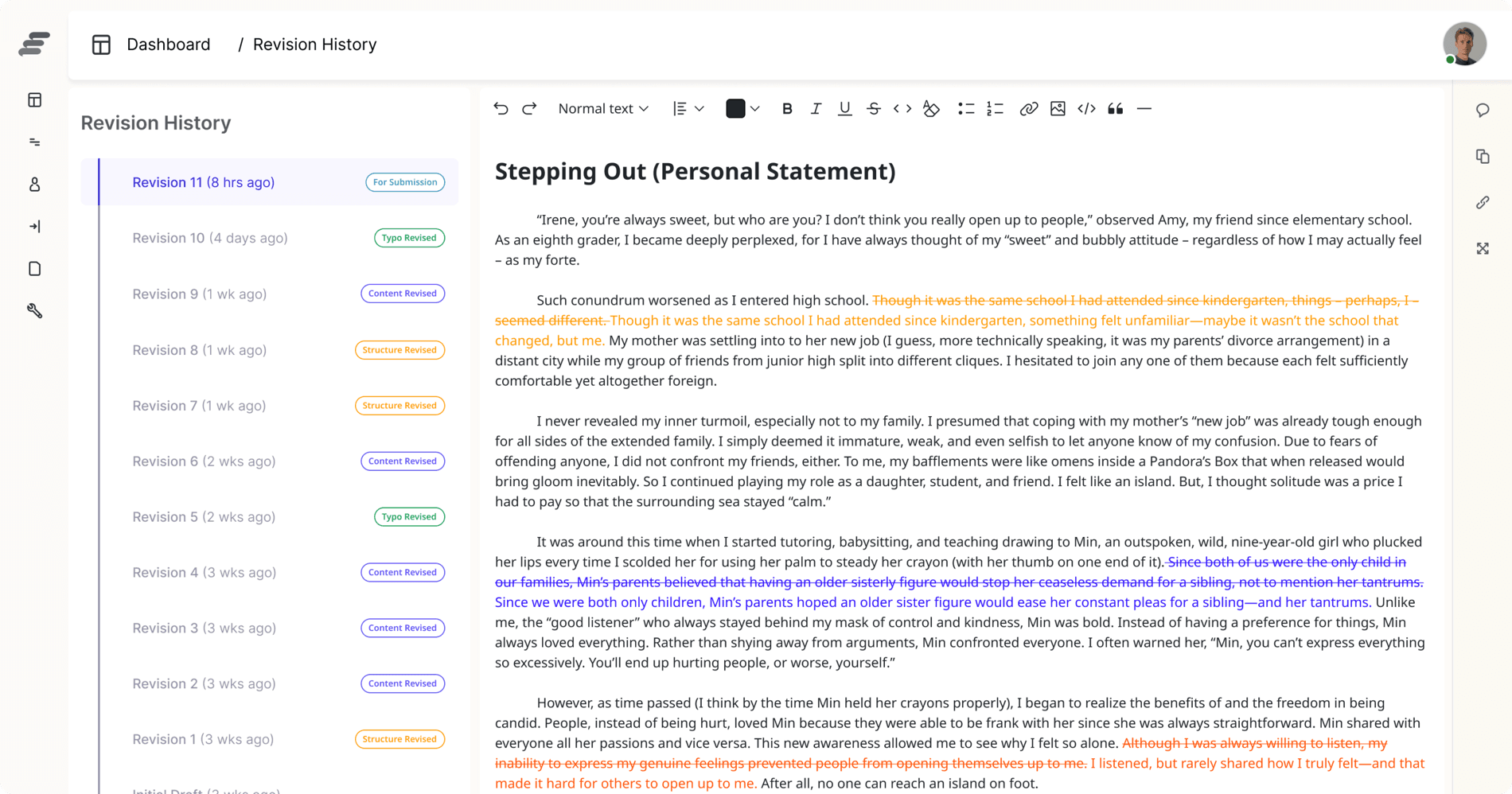
After (Interface)
The redesigned interface introduced side-by-side comparison and highlighted text changes, making revision tracking faster and easier to navigate.
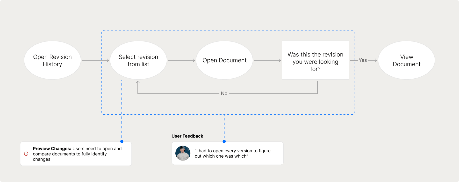
Before (Flow)
Users had to repeatedly open different revisions to identify changes, creating a slow and disruptive review process. The lack of preview visibility made it difficult to quickly compare versions.
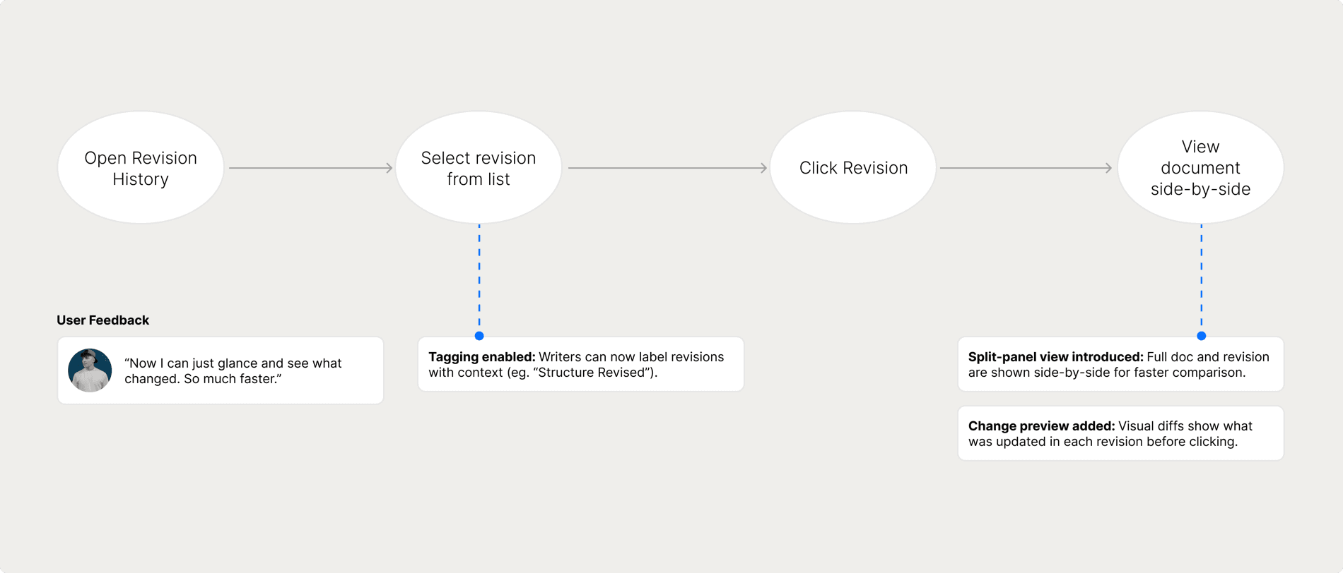
After (Flow)
Users could quickly identify changes through visual previews and revision tags, reducing the need to open multiple versions
Results & Impact
Redesigned essay feedback system served over 1,500 users and reduced mentor response time by 30%.
Team Feedback

Jason Yoon
Leaguers Tech Lead
“Lena brought the vision for Leaguers’ essay feedback system to life. Our original platform was difficult to scale and visually outdated, which made onboarding new users frustrating and time-consuming. Lena immediately understood the core pain points and reimagined the experience from both the student and mentor perspectives. Lena consistently collaborated with our engineering team to ensure designs were implementable and logically structured. She joined sprint standups, clarified edge cases, and proactively flagged usability concerns we hadn’t even considered. Thanks to her, we now have a modern system that feels intuitive, scalable, and actually enjoyable to use. Her attention to both form and function is rare, and we’re already seeing how it’s changing the way users interact with the platform.”
Reflection
Learnings
This was my first time designing an end-to-end essay feedback system, and it pushed me far beyond visual design into research, user interviews, usability testing, and cross-functional collaboration.
Bridging design and engineering
I made the mistake of handing off designs before syncing deeply with engineering. As a result, parts of the system had to be reworked for feasibility. I've since learned the value of bringing engineers into the design process early to spot constraints.
Balancing ideal and viable
There were many moments when I had to trade "perfect" for "possible." Whether it was adjusting the number of features at launch or simplifying complex flows, I learned how to prioritize what matters most for users.
Milestones
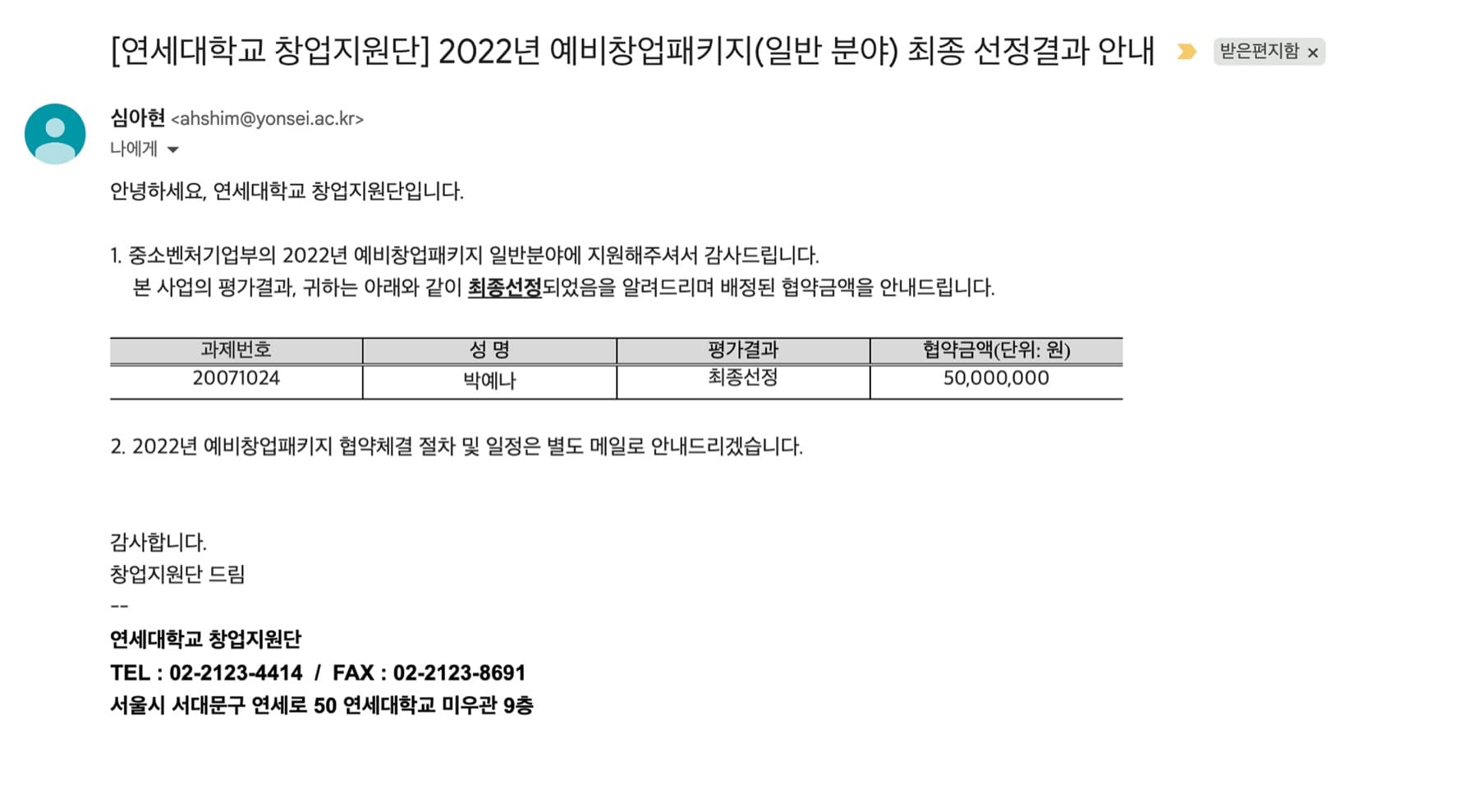
Awarded a ₩50 million (≈$40K USD) government grant from South Korea's Ministry of SMEs and Startups.
Leaguers' first headquarters in the heart of Seoul.

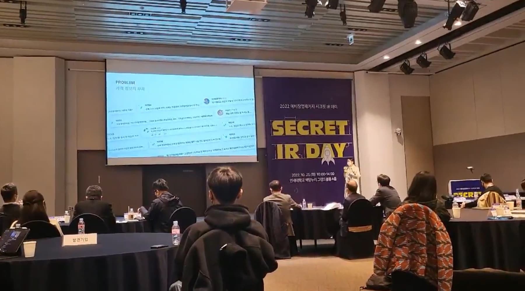
Pitching Leaguers to investors and venture capital firms in Seoul as the founding product designer.
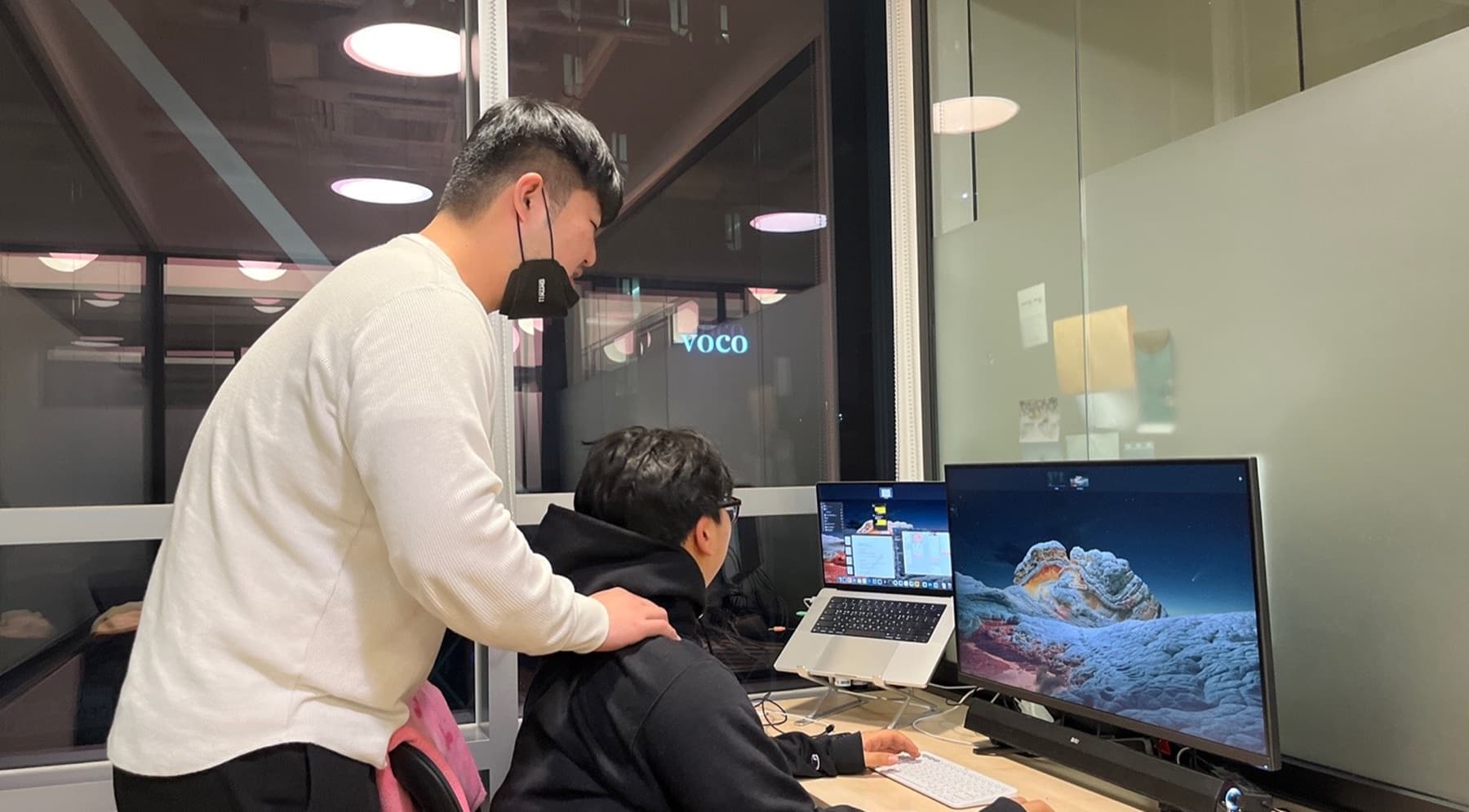
Welcoming fellow Cornellians who stopped by our office to show their support.
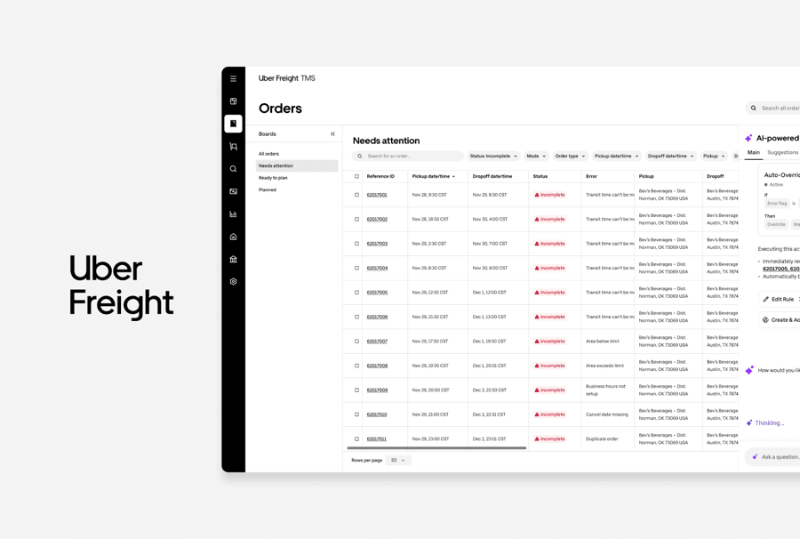
UBER FREIGHT · TMS
TMS 2.0 AI Copilot
Designed an AI Copilot solution to help operations teams resolve issues faster.
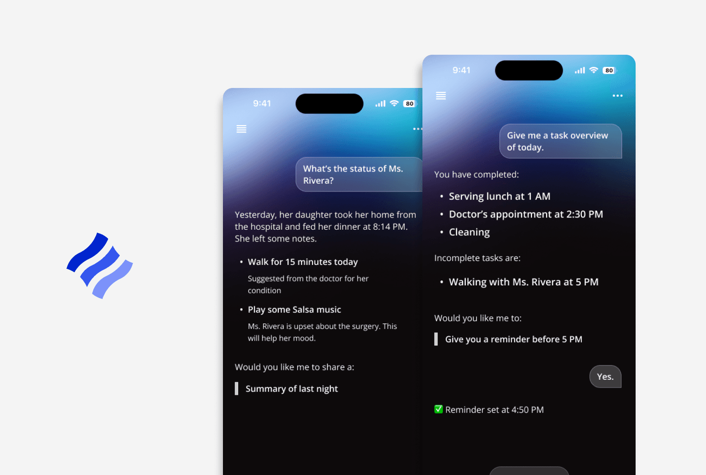
CORNELL · WARD
Conversational AI for homecare
Streamlined caregiver handoffs to help reduce communication gaps.
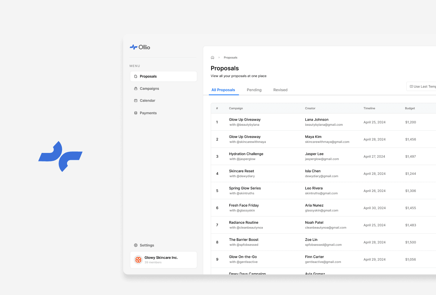
OLLIO · OLLIO
Creator Marketing Partnerships
Optimized sponsorship management for brands and creators.
KNOSIS · SCOPE
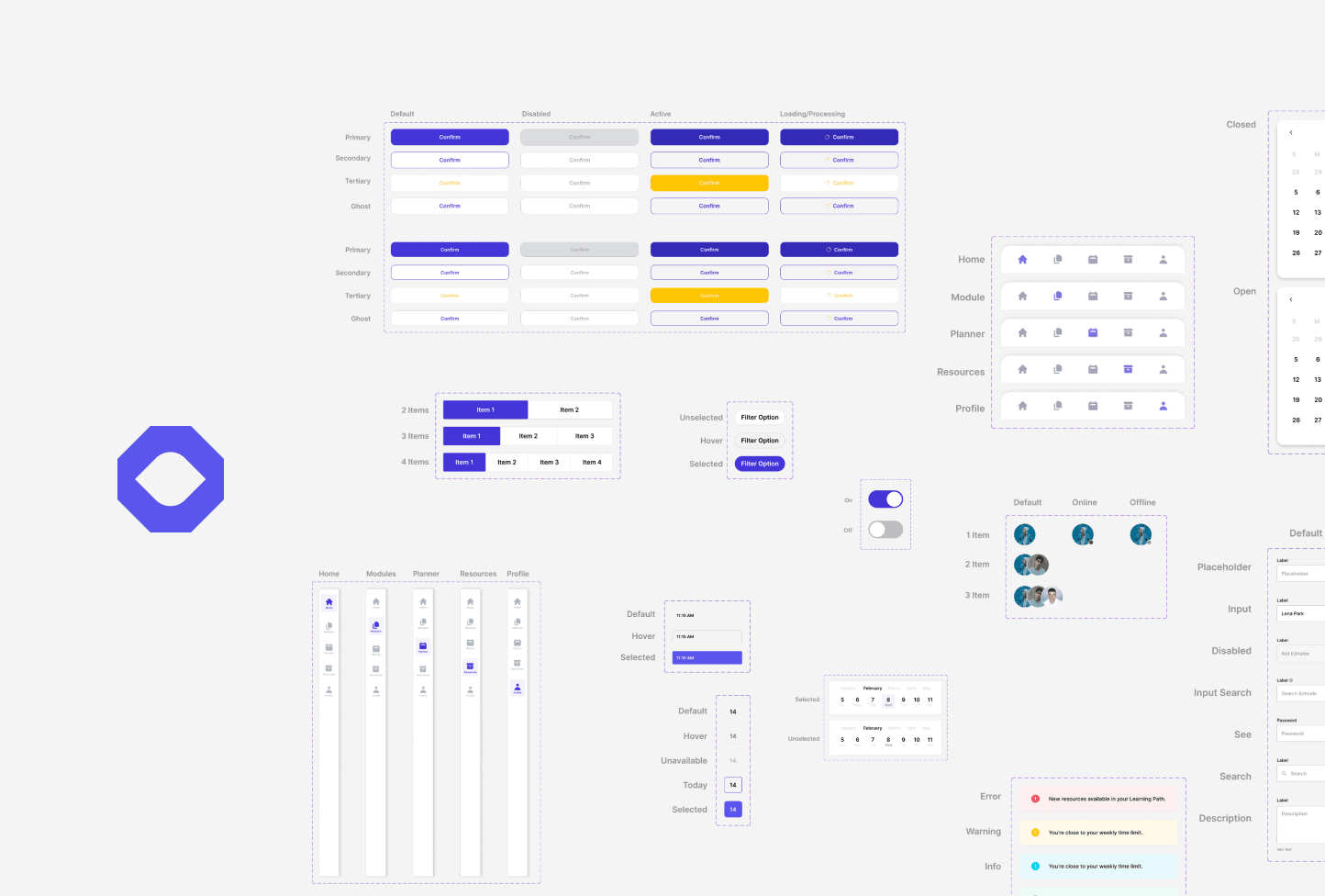
Scalable Mobile Design System
Scaled design consistency across mobile experiences.
 Coming soon
CORNELL · EQUALHEARTS
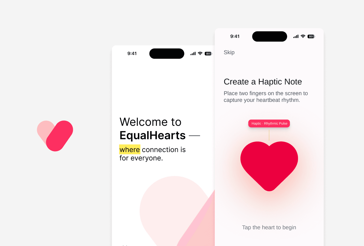
Accessibility for Online Dating
Improved accessibility in online dating for users with diverse abilities.