Ollio
Role
Product designer
Team
1 Product Manager, 5 Developers, 1 Designer
Timeline
May 2024 - Aug 2024
Skills
Product design, interface design, interaction design
Context
Ollio is a startup that wants to create a platform that serve brands and creators to easily manage sponsorship deals.
Problem
Brands and creators rely on scattered email threads, shared docs, and inconsistent communication to manage sponsorship deals, making the process time-consuming and unorganized.
Ollio needs a platform that simplifies creating sponsorship proposals for brands and managing deals for creators.
Solution
For brands
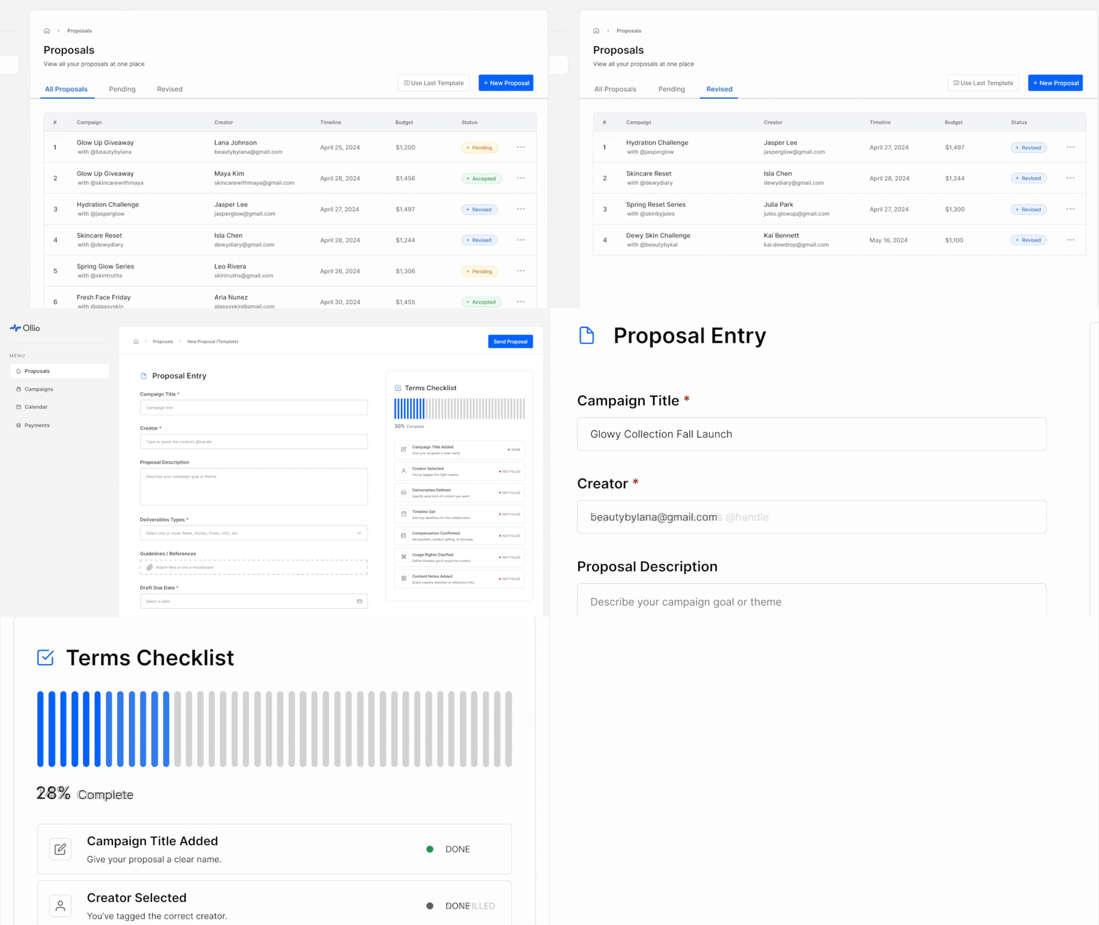
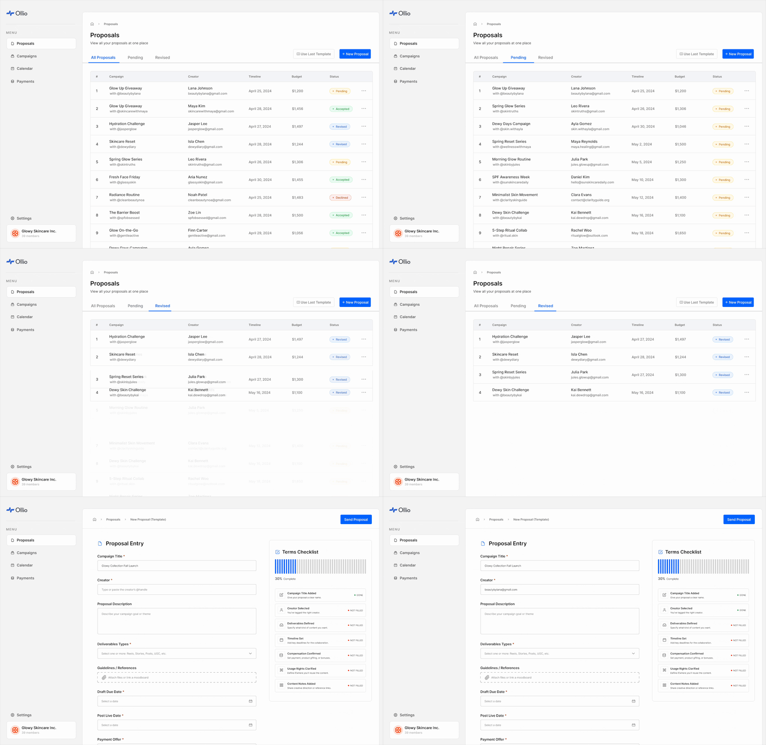
Manage sponsorships in a familiar spreadsheet view and streamline deal creation with reusable templates.
For creators
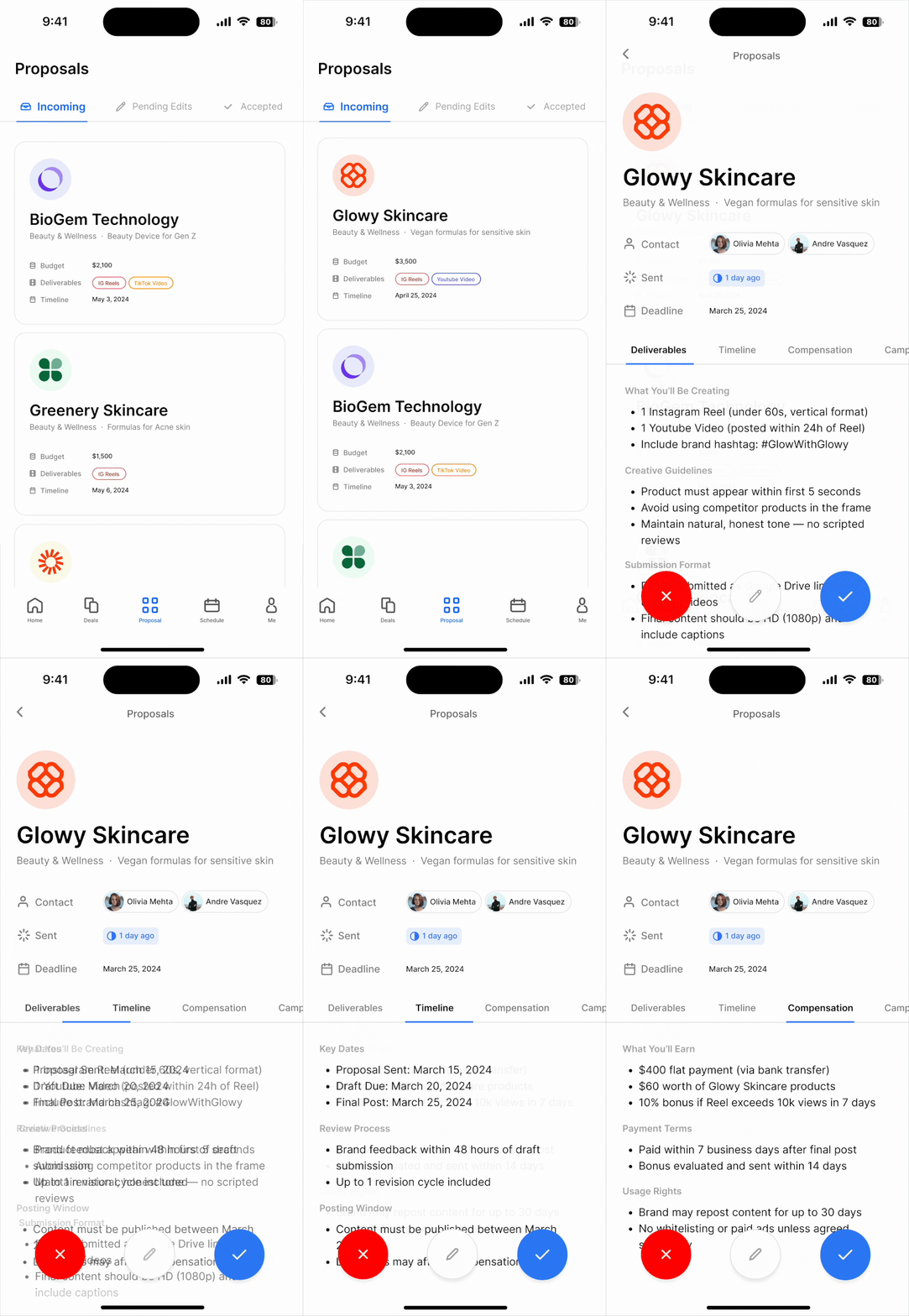
Review proposals in a mobile-friendly layout and respond quickly with built-in reply options.
User Interviews
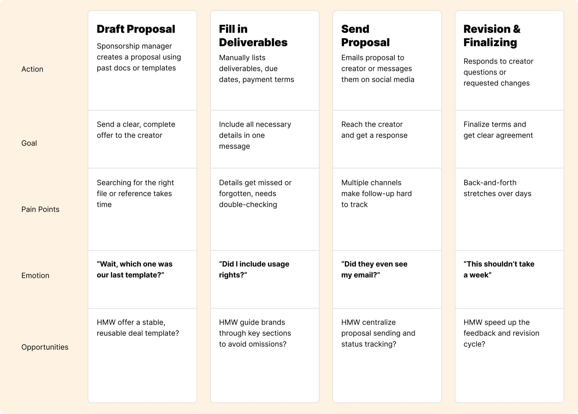
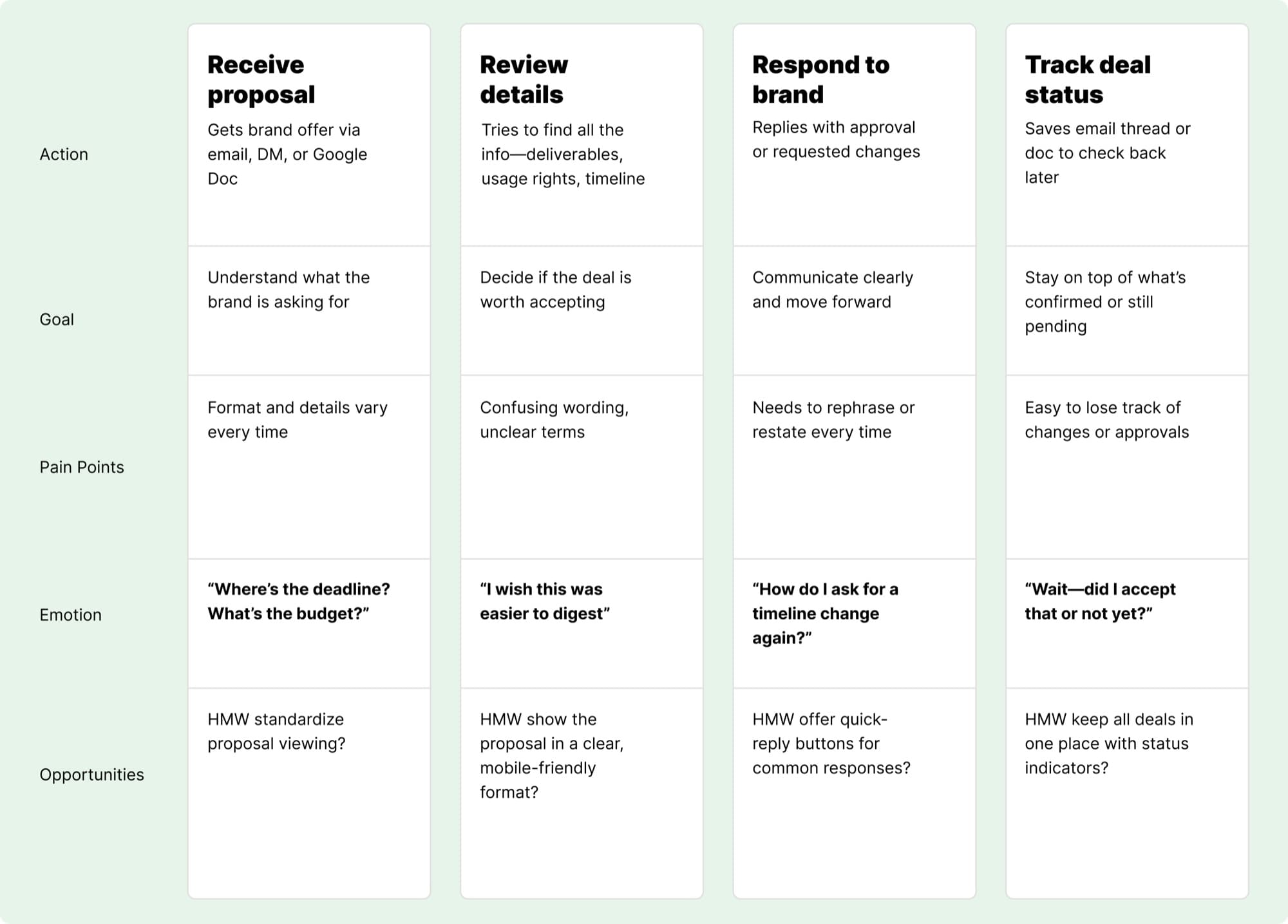
I conducted interviews with 2 brand managers and 3 creators to understand the current workflow and pain points.
Through these conversations, I uncovered key behavioral patterns that contribute to the time-consuming, fragmented nature of dealmaking.
For Brands
For Creators
Ideation Workshop
I translated the pain points and goals we uncovered into How Might We prompts to guide the ideation process.
Brands
How might we help brands reuse past proposals and ensure they aren't missing critical information?
Creators
How might we make it easier for creators to review and respond to proposals?
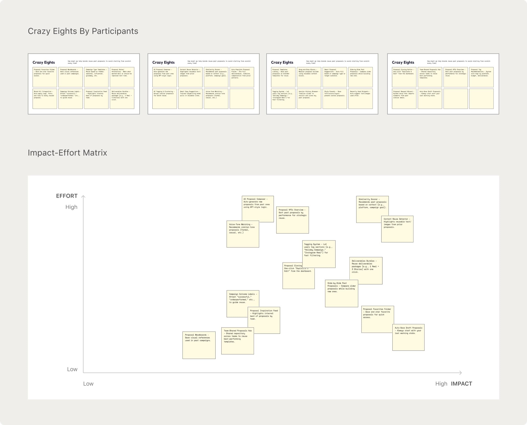
To turn insights into features, I led an ideation session with my PM and two engineers.
We ran a modified Crazy 8s to sketch ideas, then prioritized them using an impact-effort matrix, laying the groundwork for key solutions on both the brand and creator sides.
Brand Design
Start from template
Placing a “Start from Template” button next to “New Proposal” gives brands quick access to their most recently used deal format so they don't have to start from scratch.

Status at a glance
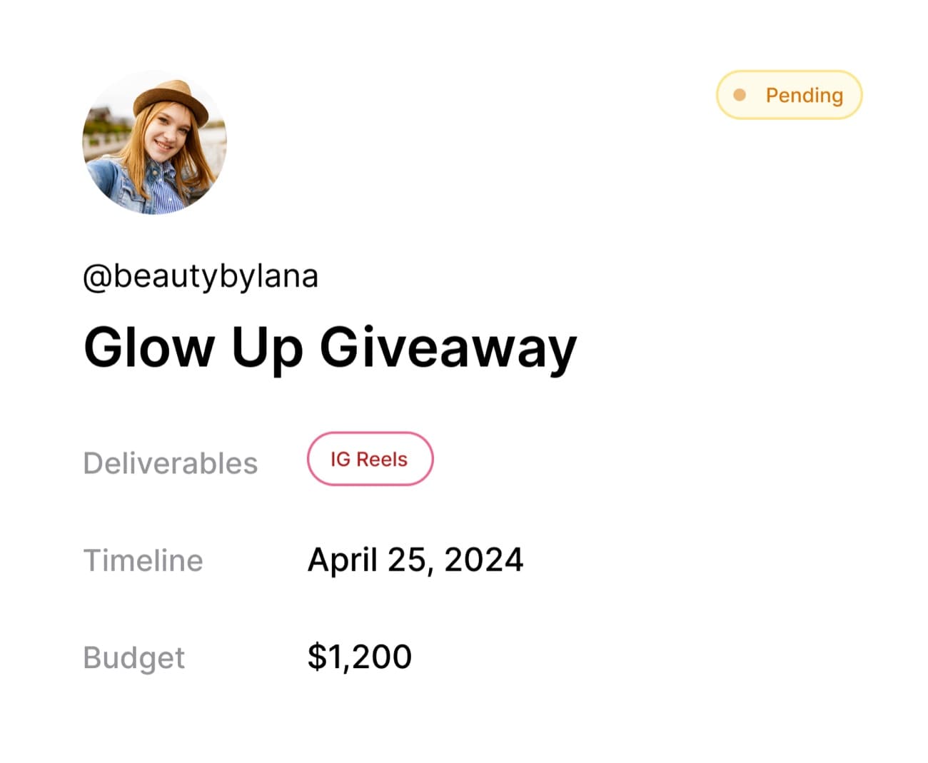
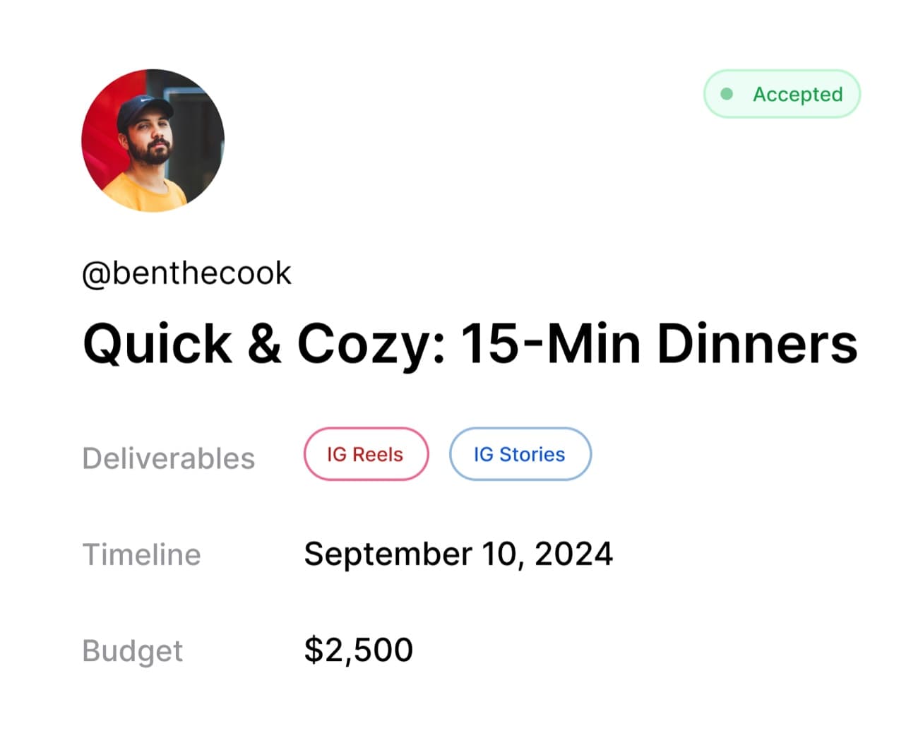
Teams relied on memory or messy spreadsheets to track deal progress. We introduced a color-coded status tag for each card.
Dynamic checklist
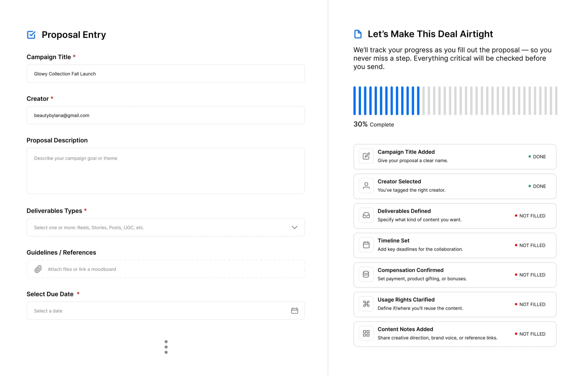
We added a real-time checklist to the proposal form that updates as each section is filled out. This prevents small oversights from turning into bigger issues.
Creator Design
Clearer terms up front
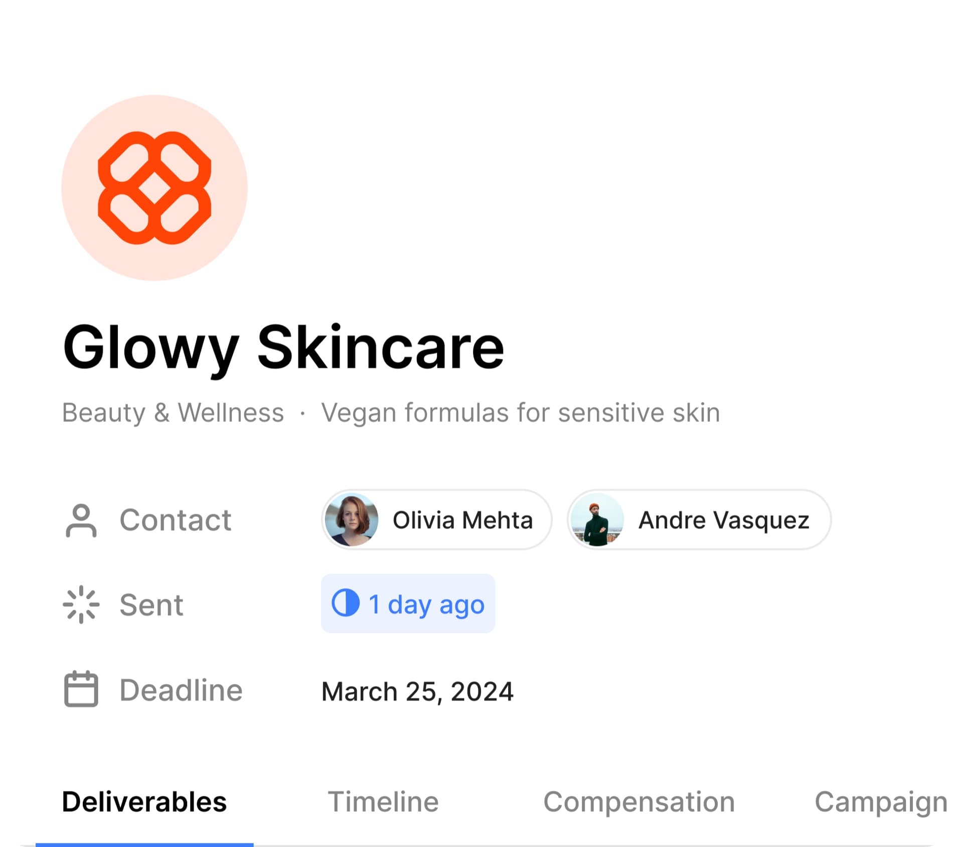
We surfaced the most important information at the top of the section in large type to help creators understand expectations at a glance.
Visual status tracking
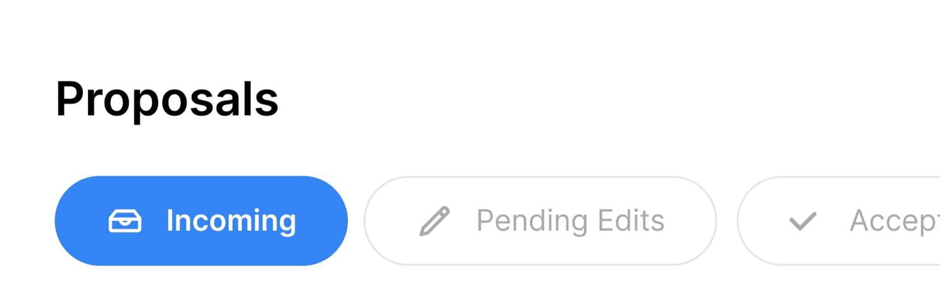
We designed a tabbed inbox with clear categories, keeping everything organized and visible in one place.
One tap responses
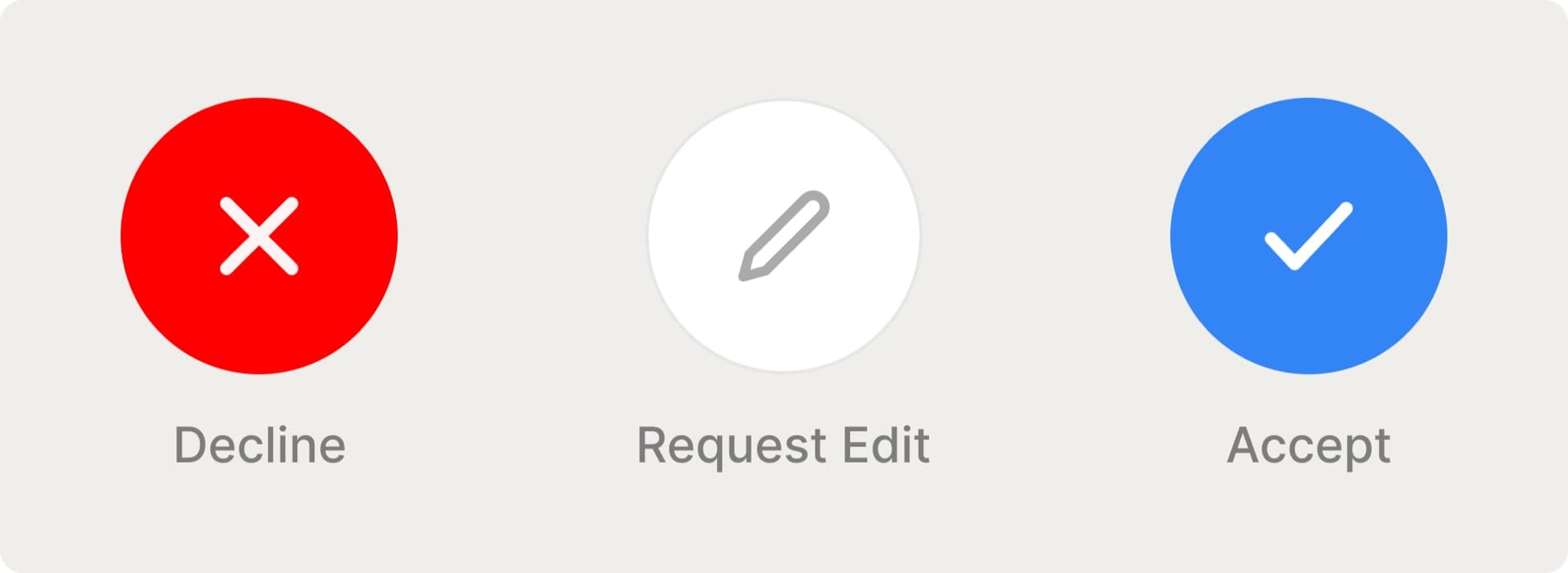
We added fixed action buttons anchored at the bottom of the proposal screen for creators to make quick actions.
User Testing
I conducted user testing sessions with 2 brand managers and 2 creators to validate key workflows before implementation.
Iteration
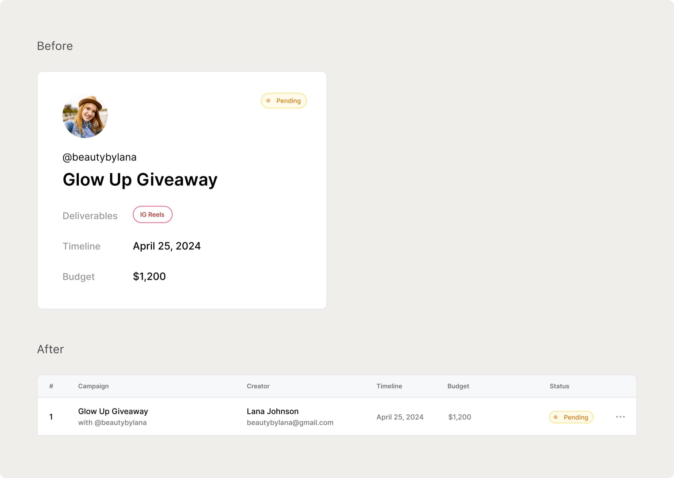
Card layout to table view
The card layout was too space-consuming for busy brand teams. Marketers had to scroll extensively or search manually to track deals. The new table view with a compact, column-based layout allowing brands to scan quickly, all in one place.
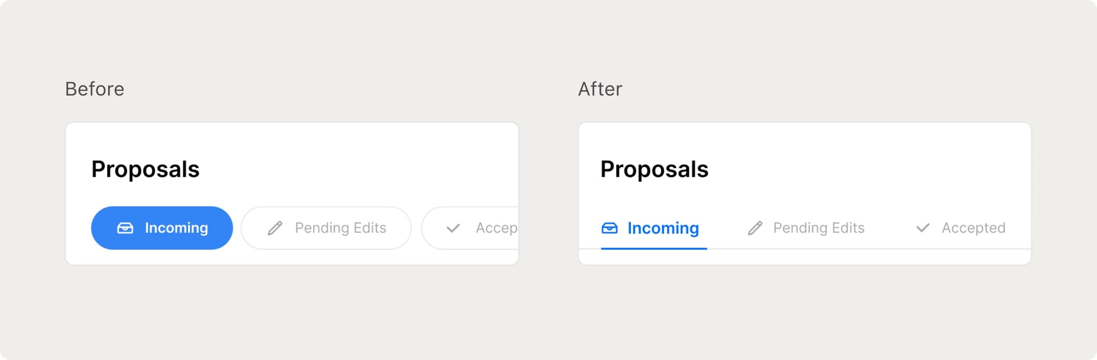
Bubble-style tabs to line-style tabs
The bubble-style tabs felt like filters, not a progress flow. So we switched to line-style tabs to show each tabs are part of a sequence. Line-style tabs gave creators a clearer sense of progression and helps reduce confusion around next steps.
Feedback

Jong Kim
Ollio Chief Executive Officer
“We were juggling scattered feedback from creators about unclear deliverables, missing status updates, and friction in accepting deals. Lena took all of that and turned it into a cohesive, actionable experience. What she came up with wasn’t just pretty interfaces, but she led user interviews, uncovered real behavioral patterns, and translated them into intuitive workflows. Her work on the proposal cards and inbox structure made decision-making feel fast and natural. Creators now have a tool that actually reflects the way they think and work. Her ability to blend systems thinking with real user empathy made a huge impact on our product direction and our users are noticing the difference.”
Reflection
Learnings
Overall, I’m proud of how I identified key workflow pain points and delivered solutions that simplified decision-making on both the brand and creator sides. If I were to revisit this project, I would be more mindful to:
Matching visual patterns to mental models
I realized how important it is to choose interaction patterns that not only look good, but align with how users naturally think about their workflow. Even subtle design choices can either reinforce or disrupt a user’s understanding of a process.
Designing for scale, not just clarity
Some design choices felt clean and intuitive at first, but didn’t hold up when used at scale. I’ve learned to think beyond visual simplicity and consider how layouts perform when there’s more data, more users, and more complexity.
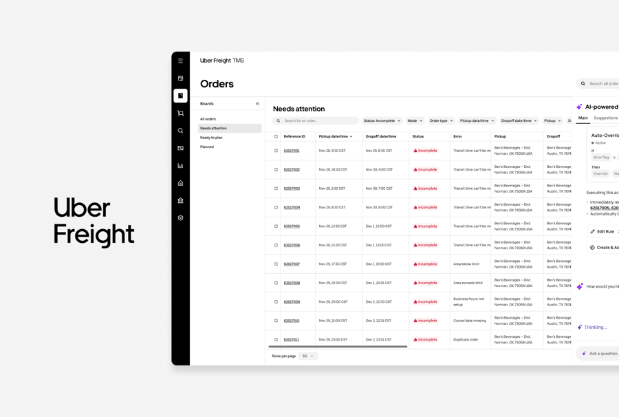
UBER FREIGHT · TMS
TMS 2.0 AI Copilot
Designed an AI Copilot solution to help operations teams resolve issues faster.
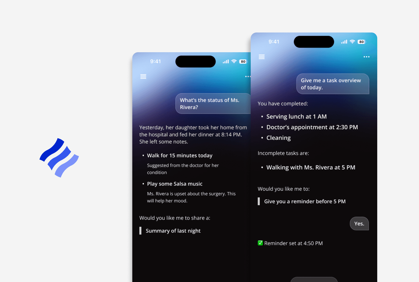
CORNELL · WARD
Conversational AI for homecare
Streamlined caregiver handoffs to help reduce communication gaps.
PHALUS · LEAGUERS
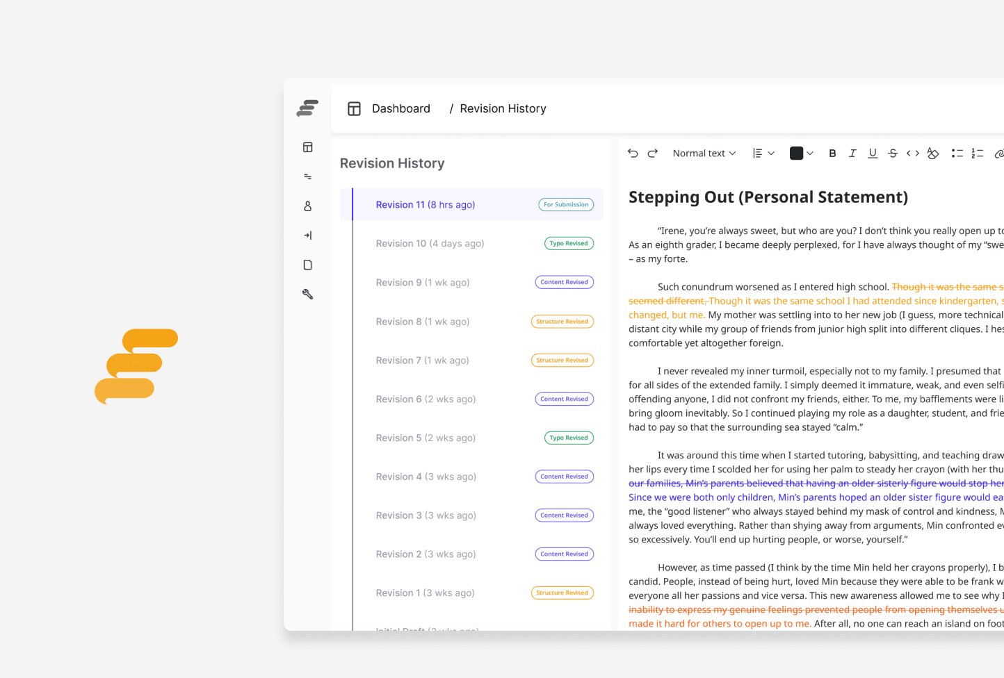
College Admissions Mentorship
Simplified mentor-student collaboration to help receive clearer feedback.
KNOSIS · SCOPE
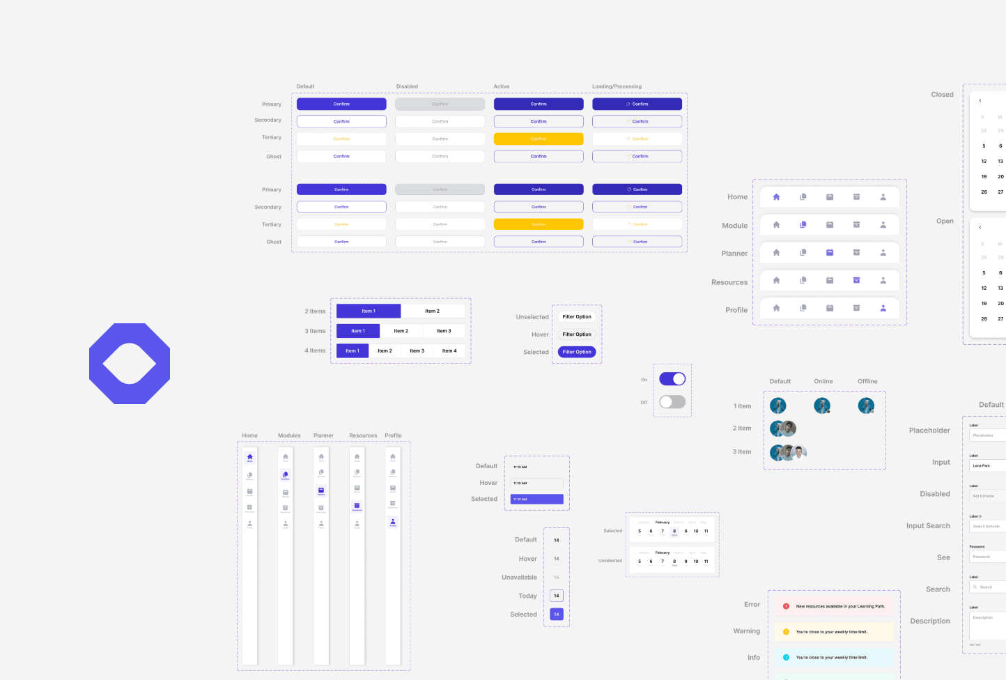
Scalable Mobile Design System
Scaled design consistency across mobile experiences.
 Coming soon
CORNELL · EQUALHEARTS
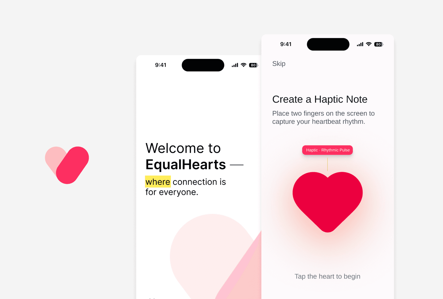
Accessibility for Online Dating
Improved accessibility in online dating for users with diverse abilities.