Scope
Role
Design Lead
Team
1 Product Manager, 1 Design Lead, 1 Tech Lead
Timeline
Sep 2024 - Nov 2024
Skills
Product design, interface design, interaction design
Context
Scope's inconsistent UI and scattered components slowed development and hurt user experience.
With recent branding updates and a need for scalable design, the team set out to build a unified design system to improve consistency, speed, and usability across the platform.
Problem
Scope had no centralized design system, leading to inconsistent visuals, duplicated components, and longer design-dev cycles.
Limited design resources resulted in an unscalable system and a mobile experience with poor responsiveness.
Goals
A unified design system for both web and mobile platforms to accelerate the design-to-development workflow.
Roadmap
Sprint Overview
Scope’s newly designed product was scheduled to roll out in August 2024. I had 2.5 months to build a full design system and update both the web and mobile platforms. Here's how I broke it down across sprints:
Web
Design System
Build all design tokens and components in Figma.
Hi-Fi Revamp
Update all screens using the new component library.
Accessibility Audit
Ensure the system follows WCAG 2.1 guidelines.
Mobile
Responsiveness Research
Analyze responsive behaviors for design constraints.
Design System
Build complete design system components in Figma.
Hi-Fi Revamp
Design system with emphasis on responsive clarity.
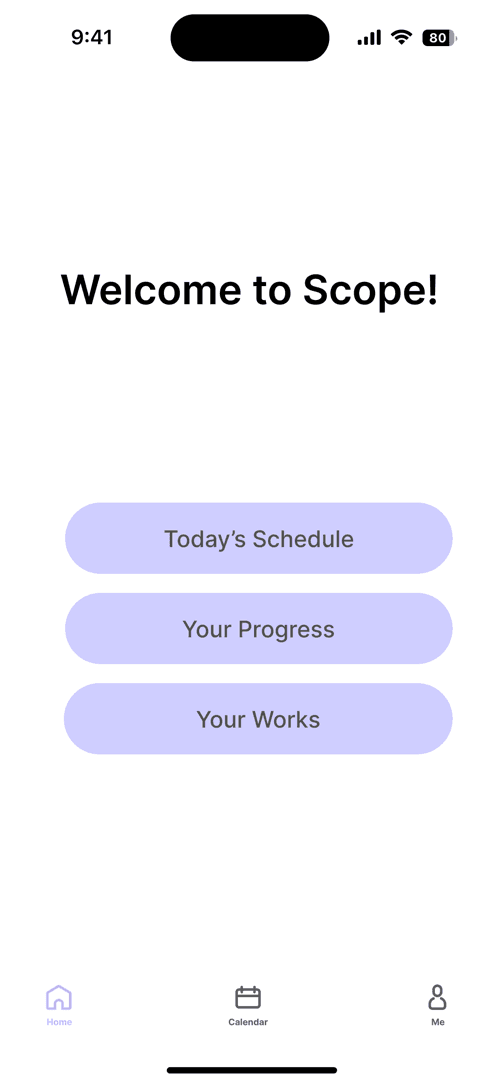
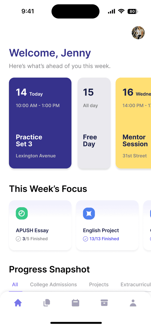
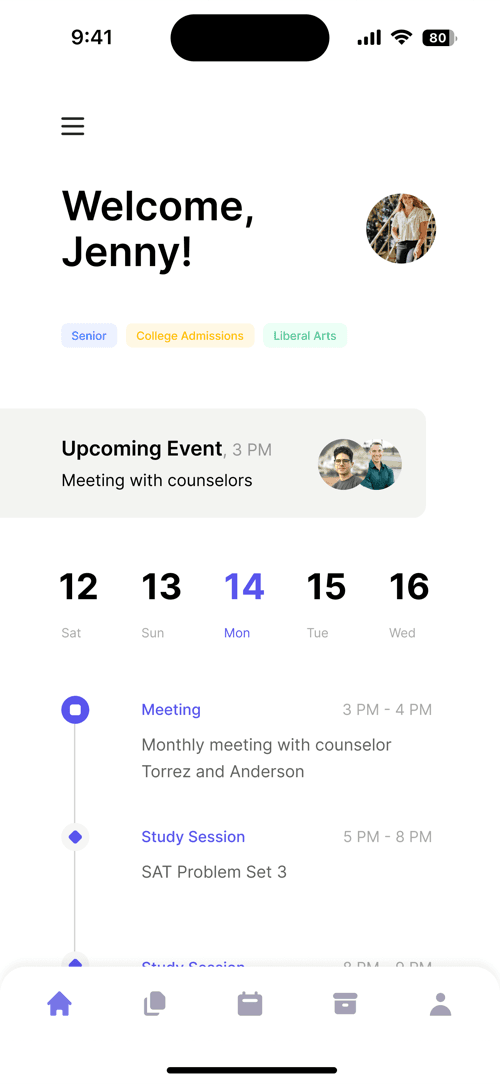
Building Sample
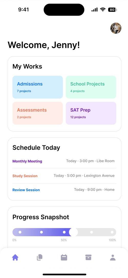
To align stakeholders, I first created mockups for key web and mobile screens using early design tokens like color, type, and spacing.
These samples ensured the visual direction was consistent across platforms and helped validate responsiveness, accessibility, and layout before building the full component library.
Building Foundation
I defined foundational design tokens to scale Scope's interface across web and mobile.
These tokens ensure visual consistency and allow future components to be built with speed and clarity across devices.
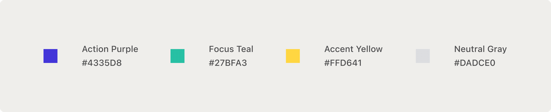
Color
I made a semantic-based color system so each color communicates purpose. All combinations were tested for accessibility using Material Design’s contrast tools.
Typography
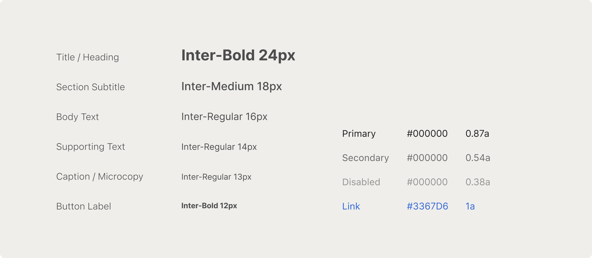
I implemented a dynamic type system that scales across screen sizes and user preferences.
Other Tokens
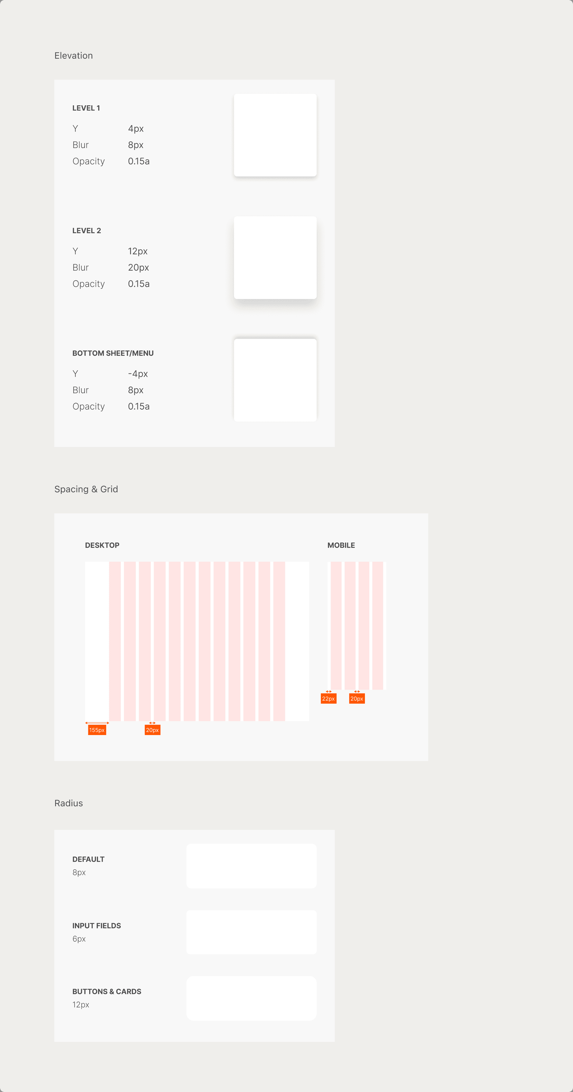
These tokens support layout and subtle interactions across the design system.
Building Components
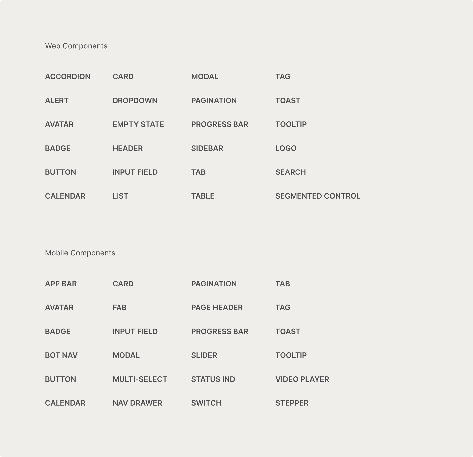
To support consistent design across platforms, I built a comprehensive UI component library from scratch.
The categorized lists below outline the full inventory of components I created for each platform.
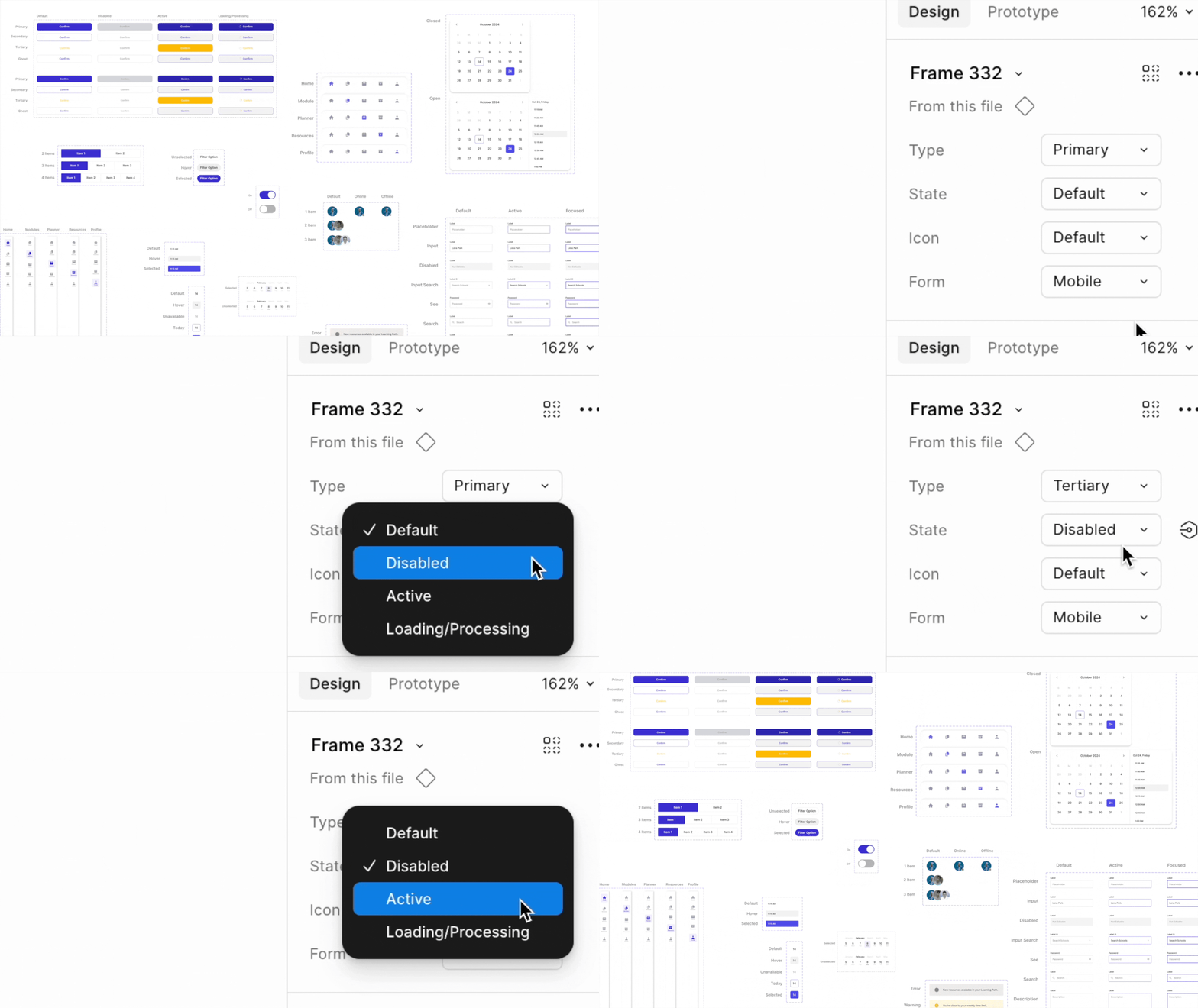
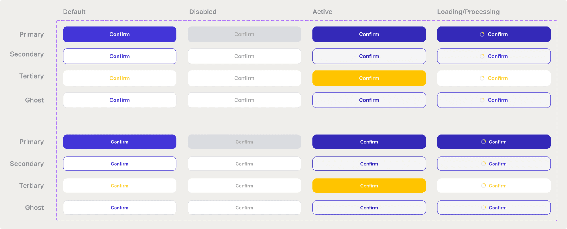
Variants
For each component, I built out all possible states and combined them as variants in Figma. To ensure adoption, I also ran Figma onboarding sessions and recorded step-by-step video tutorials, so the team could confidently use the design system.
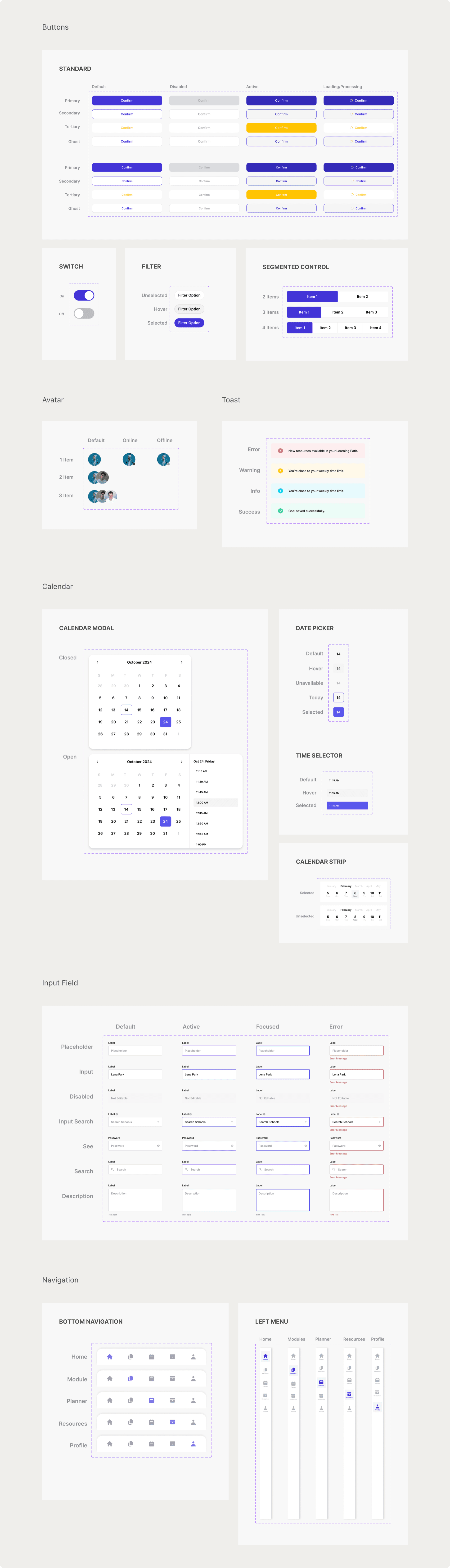
Component setting in action
Here's how the component settings worked in practice with pre-defined variants and flexible toggles, allowing designers to move from wireframe to high-fidelity mockups in minutes.

In Total I’ve Built
168 Web Components & 211 Mobile Components
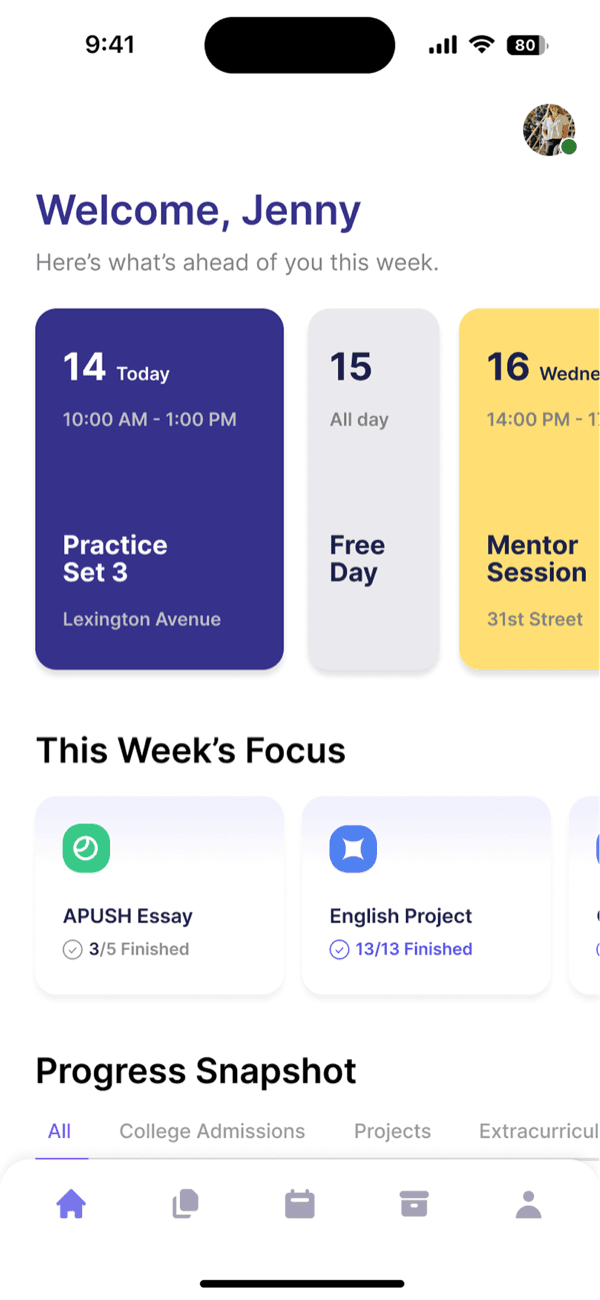
Update Interface
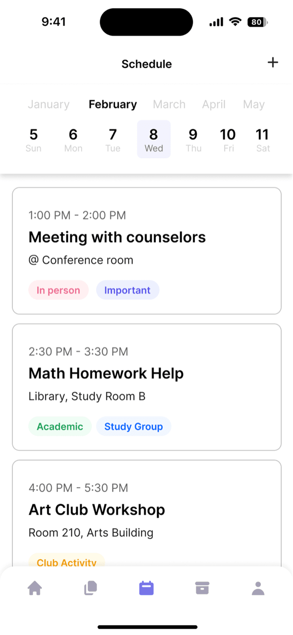
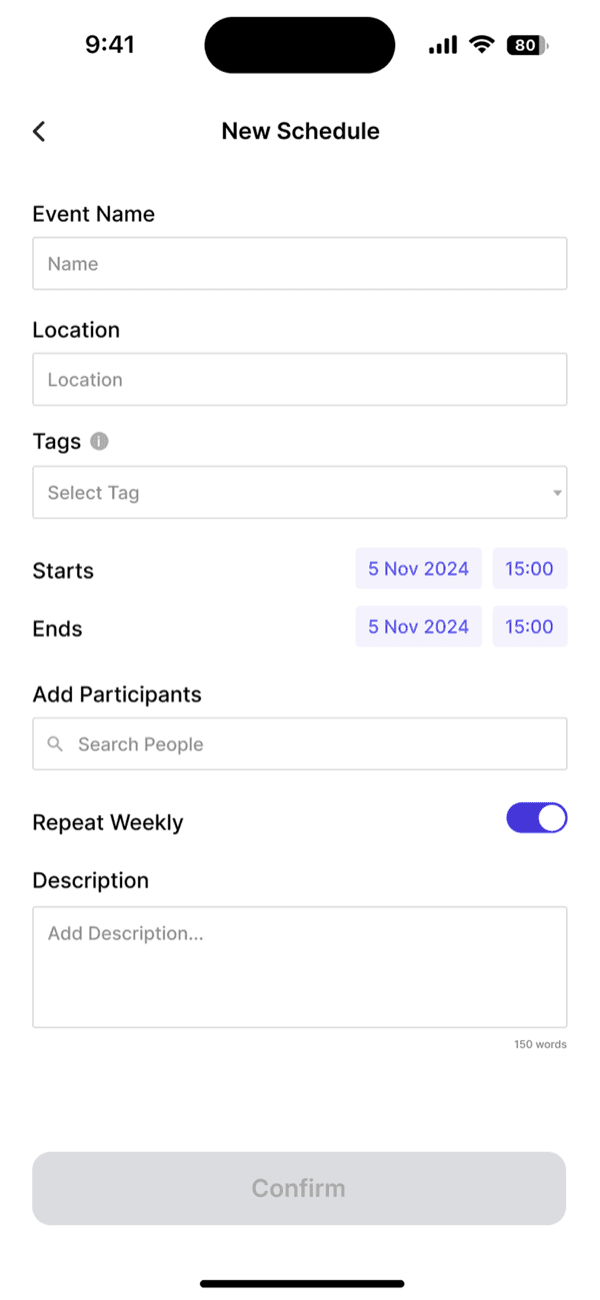
I redesigned every screen across both web and mobile platforms using the new design system.
Accessibility
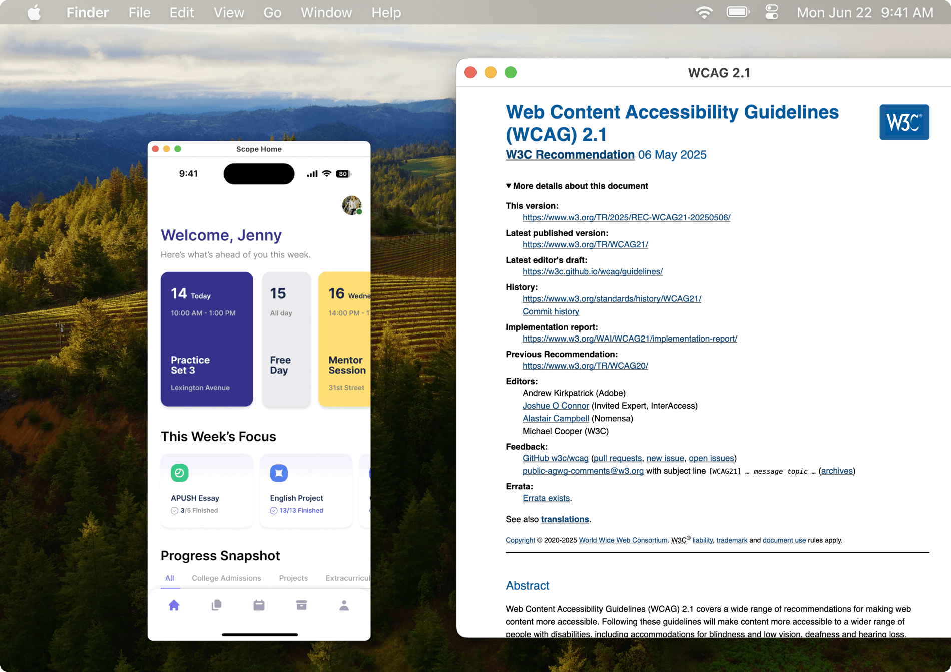
To ensure the platform was inclusive and accessible, I audited every screen against WCAG 2.1 guidelines, focusing on visual clarity, keyboard navigation, and screen reader compatibility.
Results & Impact
Design-to-development cycles were shortened by 2 times.
Feedback

Jun Koo
KNOSIS Chief Executive Officer
“Lena built Scope’s first-ever design system from the ground up, and we immediately saw the impact. She approached the project with both precision and speed. She not only established a robust token system and accessible components but also revamped our core UI screens using the new system, staying collaborative with product and engineering. This system will continue to power our team long after the initial build.”
All product images and descriptions displayed were approved by KNOSIS Inc. for the Scope Design System project.
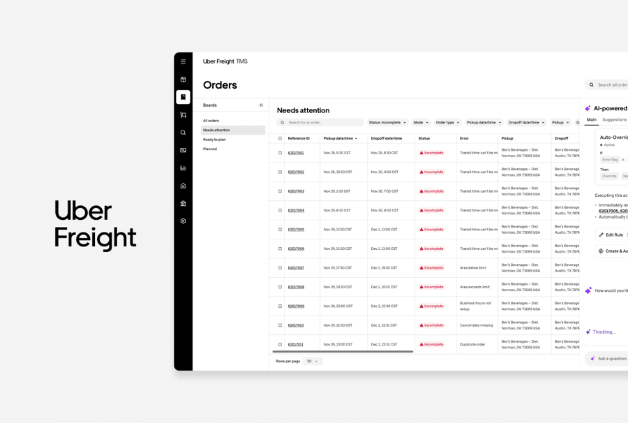
UBER FREIGHT · TMS
TMS 2.0 AI Copilot
Designed an AI Copilot solution to help operations teams resolve issues faster.
CORNELL · WARD
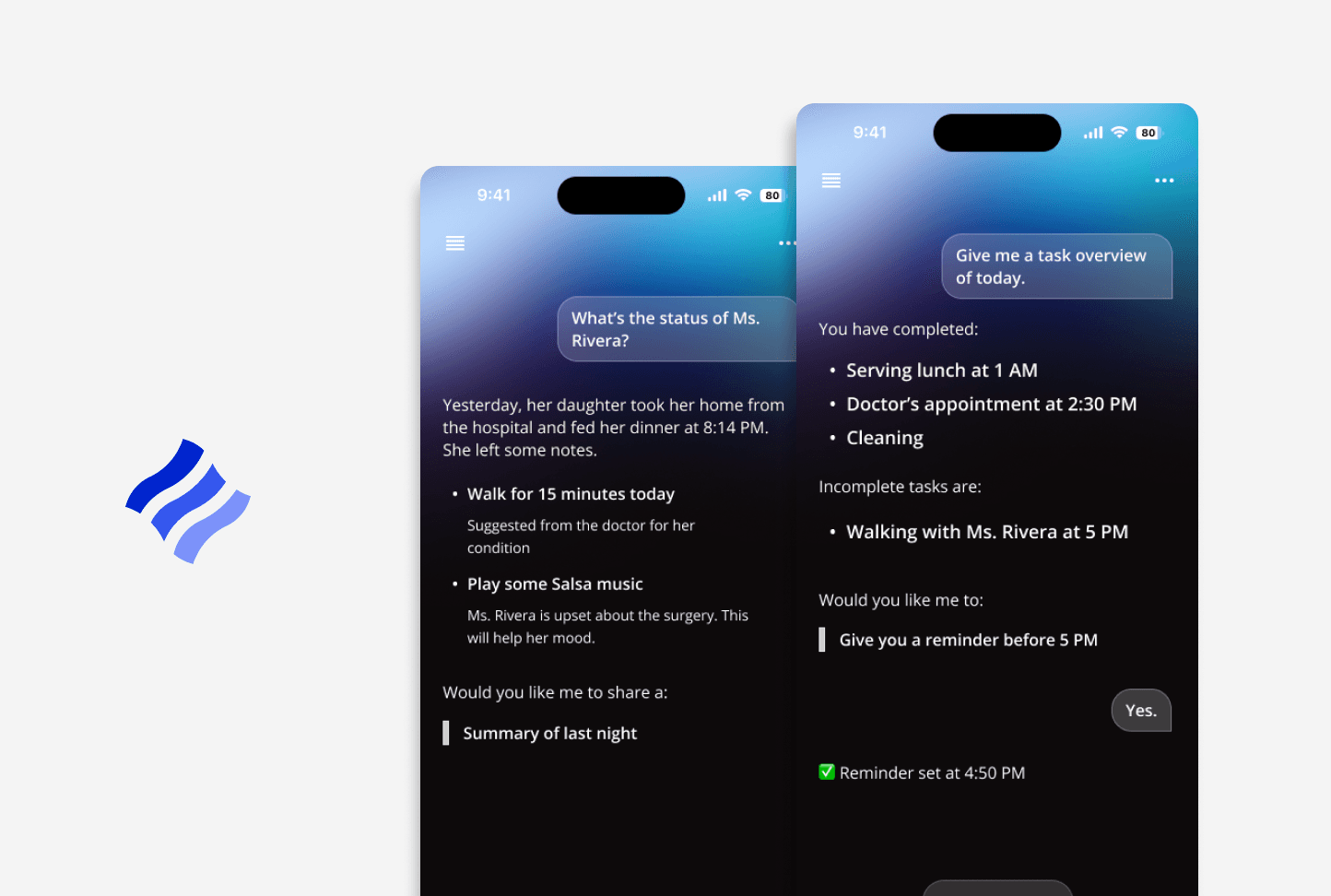
Conversational AI for homecare
Streamlined caregiver handoffs to help reduce communication gaps.
PHALUS · LEAGUERS
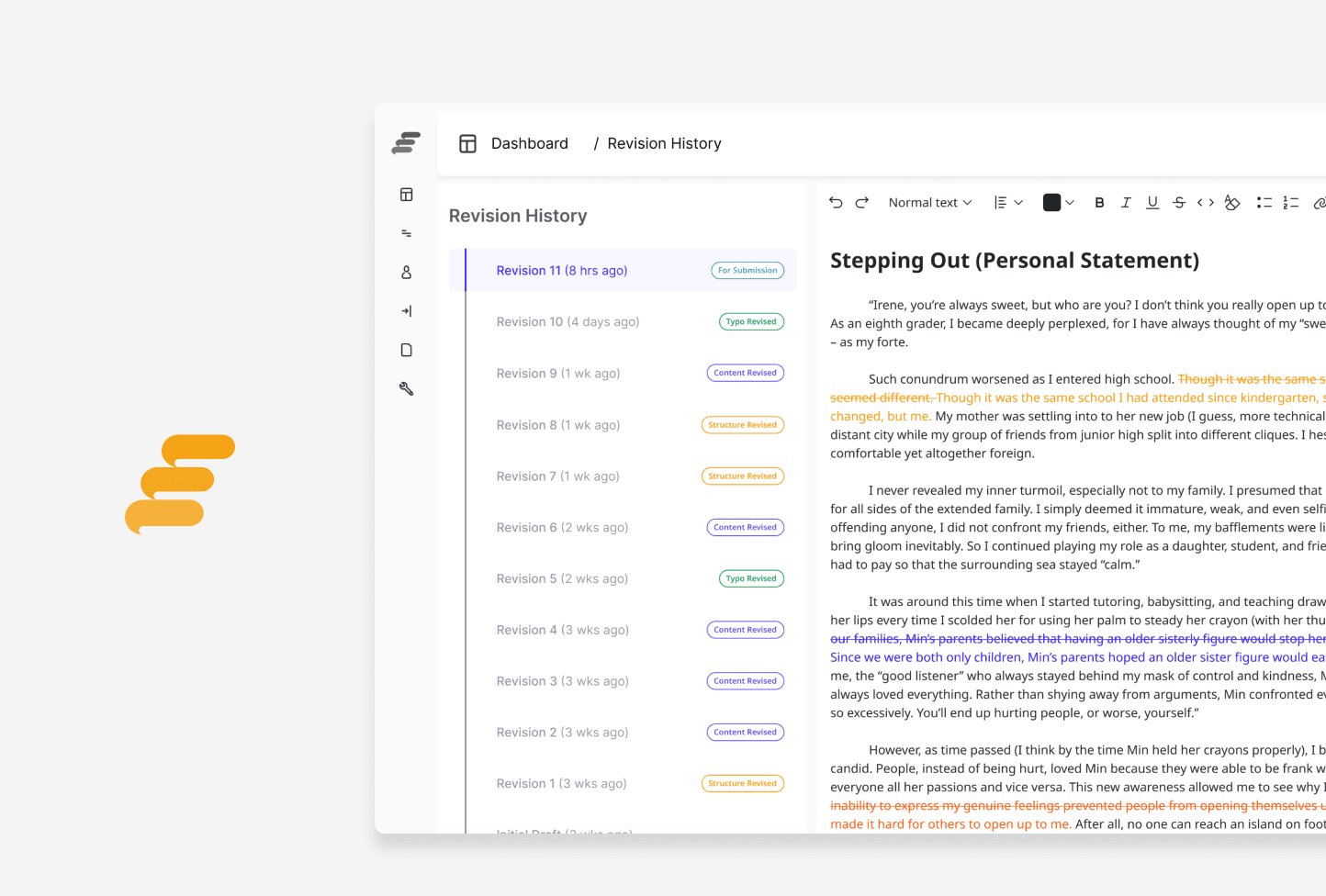
College Admissions Mentorship
Simplified mentor-student collaboration to help receive clearer feedback.
OLLIO · OLLIO
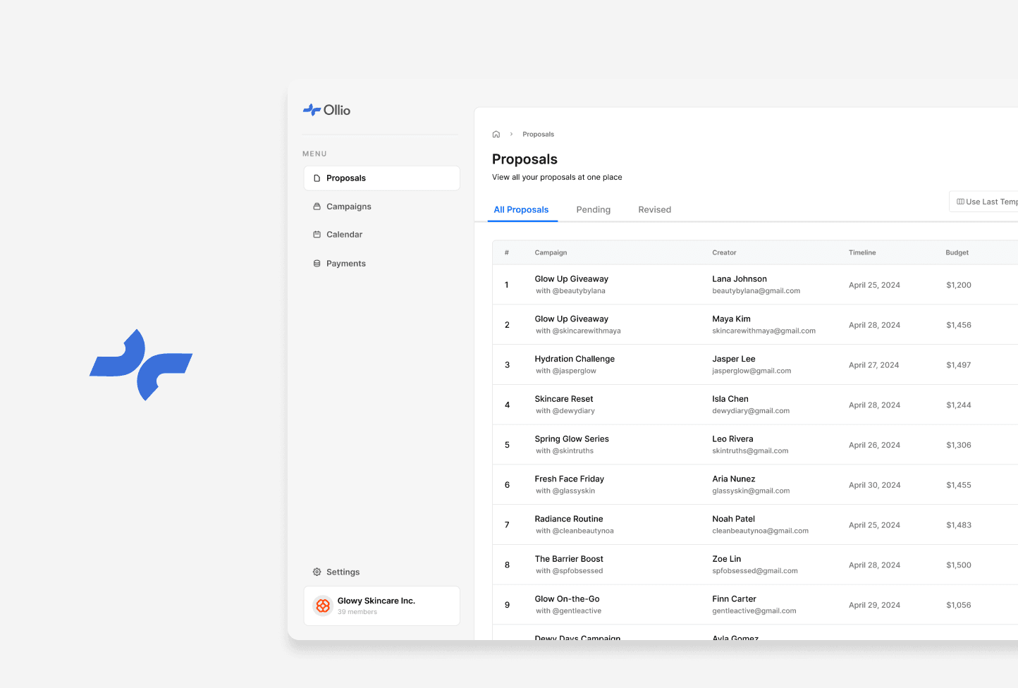
Creator Marketing Partnerships
Optimized sponsorship management for brands and creators.
 Coming soon
CORNELL · EQUALHEARTS
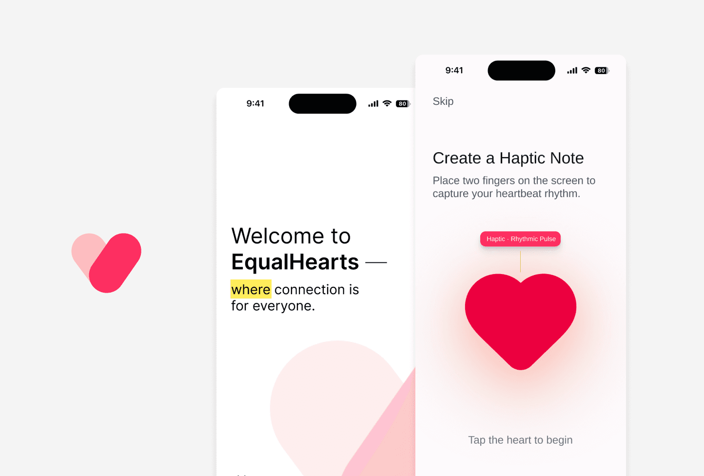
Accessibility for Online Dating
Improved accessibility in online dating for users with diverse abilities.